Color
Eight colors. Each chosen to carry a specific emotional weight — grounded in real places, real moments, and real intention.
Origin · How these colors were chosen
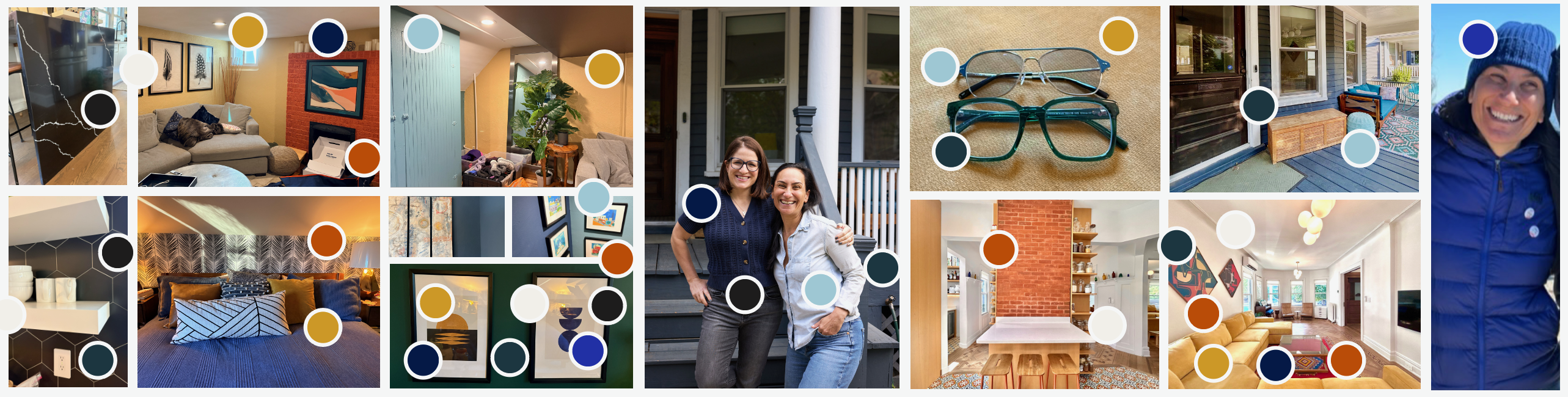
The palette was derived from a mood board rooted in real environments and real people — Jenna and Stacy's daily lives.
Color values
Neutrals
Clear White
open, transparent, neutral
#F9F8F2
80%
60%
40%
20%
Grounded Black
solid, direct, stable
#1F1E1E
80%
60%
40%
20%
Primary
Radiant Gold
warm, insight, emphasis
#CD9F36
80%
60%
40%
20%
Intentional Blue
action, purpose, confidence
#2531A5
80%
60%
40%
20%
Steady Blue
leadership, authority, safety
#061A49
80%
60%
40%
20%
Secondary
Calm Blue
listen, reflect, slow down
#ACCDD9
80%
60%
40%
20%
Clean Slate
foundation, nuance, trust
#1E4D5C
80%
60%
40%
20%
Honest Ochre
tension, truth, vulnerability
#B55312
80%
60%
40%
20%
Accessible color combinations
Leadership starts here.
Clear White on Steady Blue
Leadership starts here.
Calm Blue on Steady Blue
Leadership starts here.
Radiant Gold on Steady Blue
Let’s work on it.
Clear White on Clean Slate
Let’s work on it.
Calm Blue on Clean Slate
Let’s work on it.
Radiant Gold on Clean Slate
Take the next step.
Clear White on Intentional Blue
Take the next step.
Calm Blue on Intentional Blue
Take the next step.
Radiant Gold on Intentional Blue
Real, direct, grounded.
Clear White on Grounded Black
Real, direct, grounded.
Calm Blue on Grounded Black
Real, direct, grounded.
Radiant Gold on Grounded Black
Name what’s true.
Clear White on Honest Ochre
Name what’s true.
Steady Blue on Honest Ochre
Name what’s true.
Grounded Black on Honest Ochre
This is the moment.
Steady Blue on Radiant Gold
This is the moment.
Clean Slate on Radiant Gold
This is the moment.
Grounded Black on Radiant Gold
Slow down to listen.
Steady Blue on Calm Blue
Slow down to listen.
Clean Slate on Calm Blue
Slow down to listen.
Grounded Black on Calm Blue
Space to think clearly.
Steady Blue on Clear White
Space to think clearly.
Clean Slate on Clear White
Space to think clearly.
Grounded Black on Clear White
Color attributes & intended use
| Name | Attributes | When to use | |
|---|---|---|---|
Steady Blue |
leadership, authority, safety |
Primary brand color. Use for hero backgrounds, key headlines, navigation, and any context that should feel authoritative and trustworthy. |
|
Intentional Blue |
action, purpose, confidence |
Calls to action, buttons, interactive elements. Signals something is clickable, decisive, or action-oriented. |
|
Radiant Gold |
warm, insight, emphasis |
Accent and emphasis. Use sparingly for pull quotes, key stats, highlights, and moments of insight. Pairs strongly with all three blues. |
|
Clean Slate |
foundation, nuance, trust |
Section backgrounds, supporting panels, and secondary containers. Conveys depth and groundedness without the authority of Steady Blue. |
|
Calm Blue |
listen, reflect, slow down |
Backgrounds for reflective or editorial content — testimonials, coach bios, breathing room. Also used as a text color on dark backgrounds at AAA. |
|
Honest Ochre |
tension, truth, vulnerability |
Use with intention — for moments of challenge, honesty, or disruption. Not a background at scale; works well as a bold accent or illustration tone. |
|
Clear White |
open, transparent, neutral |
Primary page background and text on dark surfaces. The slight warmth (vs. pure white) keeps the brand from feeling clinical or cold. |
|
Grounded Black |
solid, direct, stable |
Body text, footers, high-contrast contexts. Use instead of pure black to maintain warmth. Avoid as large background areas — reserve for direct, emphatic moments. |