Social
How Work Better Together shows up on Instagram and LinkedIn: posts, carousels and Stories, all made from our real words, collages and photos.
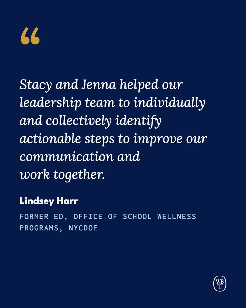
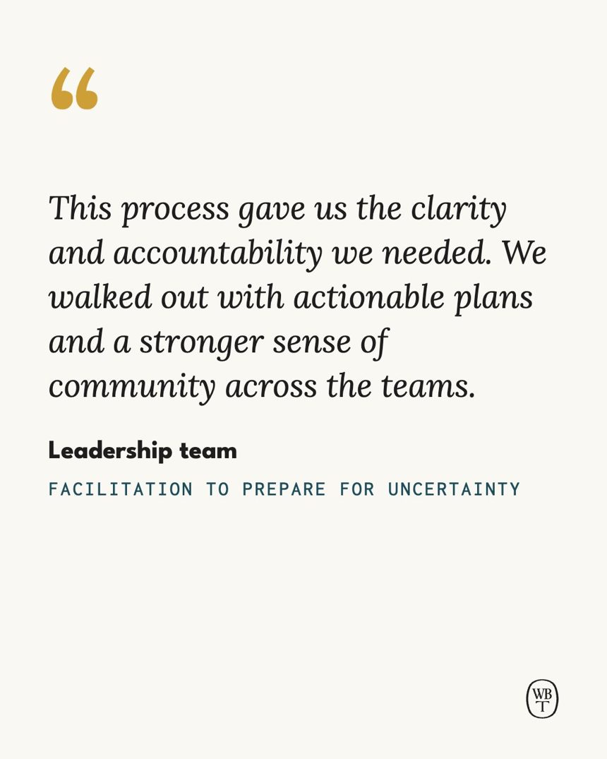
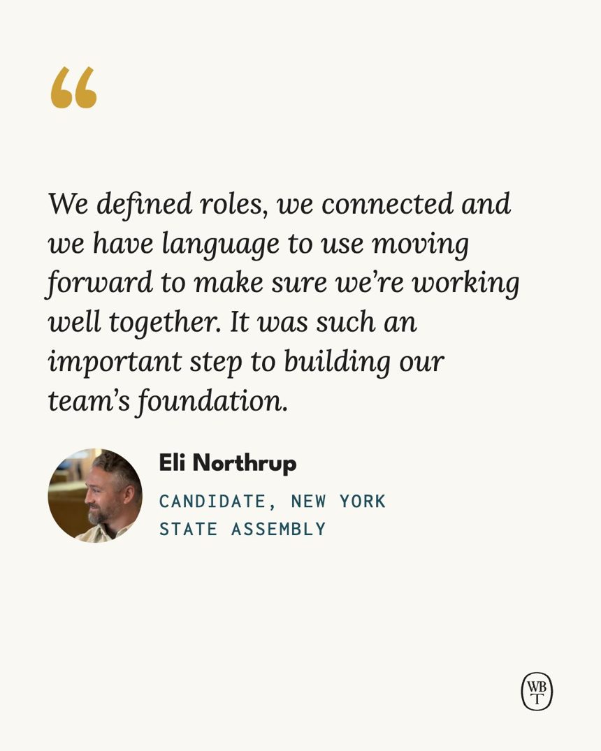
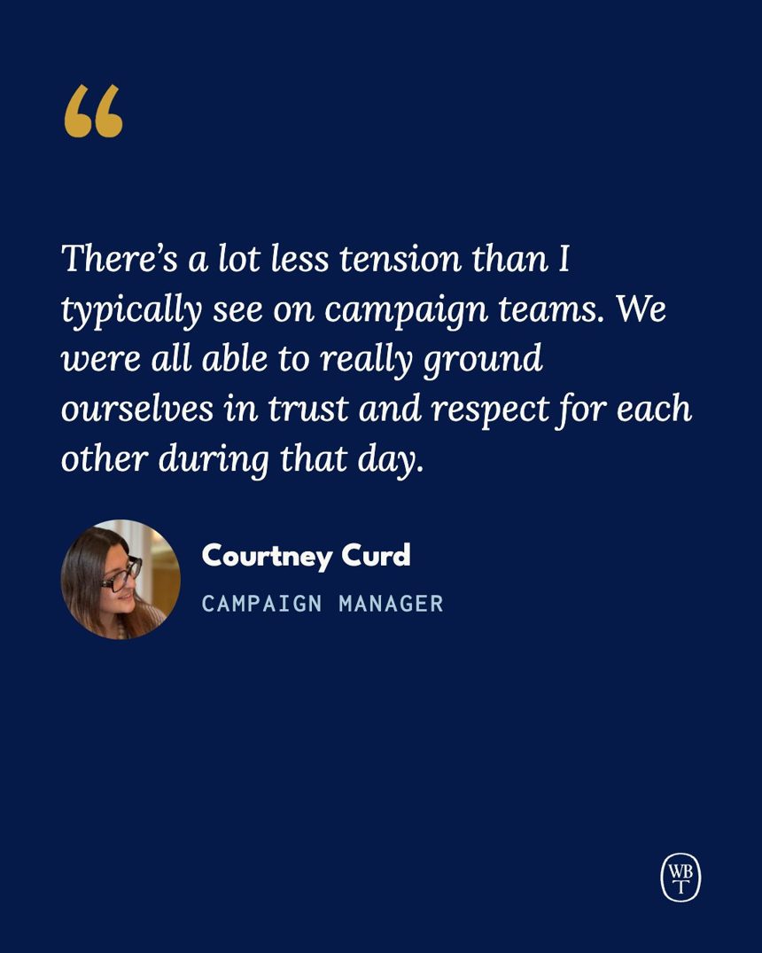
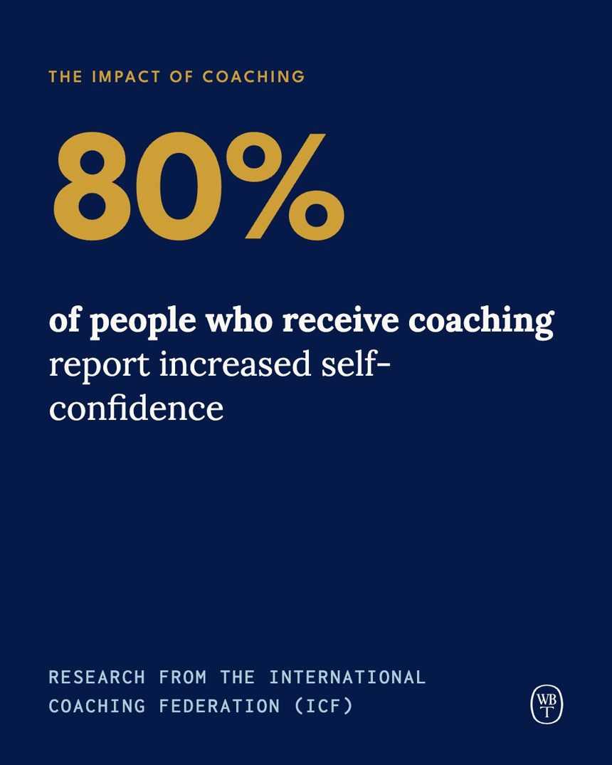
Single posts at 1080×1350. Collage posts sit on light grounds so the black scribble reads; quotes, stats and type-only posts can go dark. Most grounds are solid brand colors, with an occasional watercolor wash. Every word here comes from our site, case studies and resources. Laid out like our Instagram grid: three across.
Services
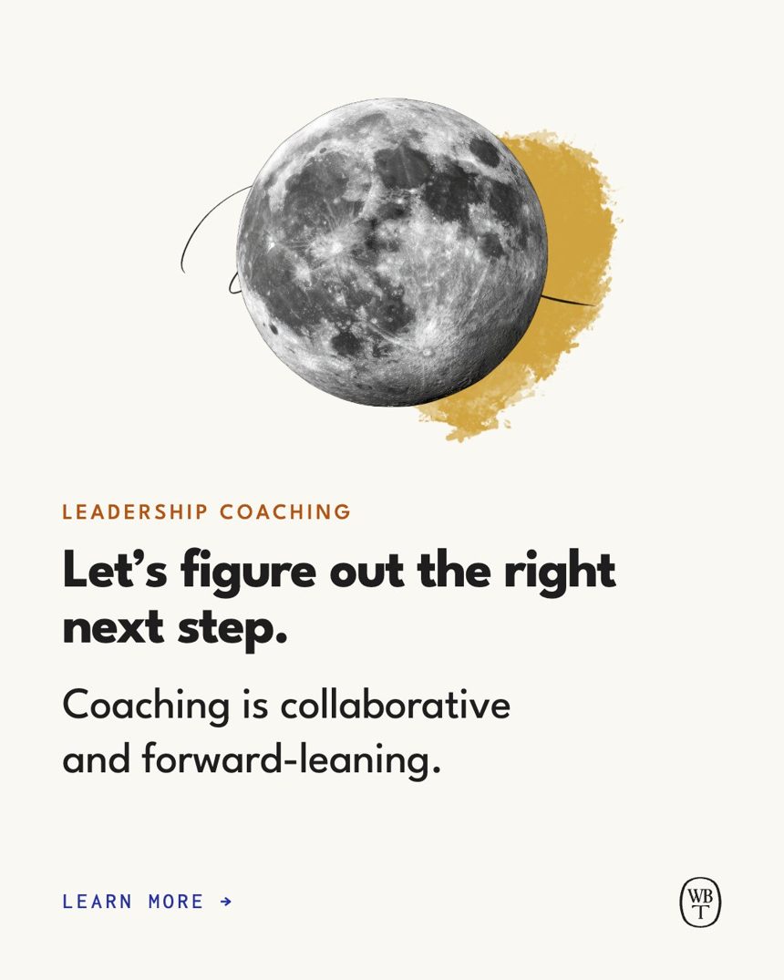
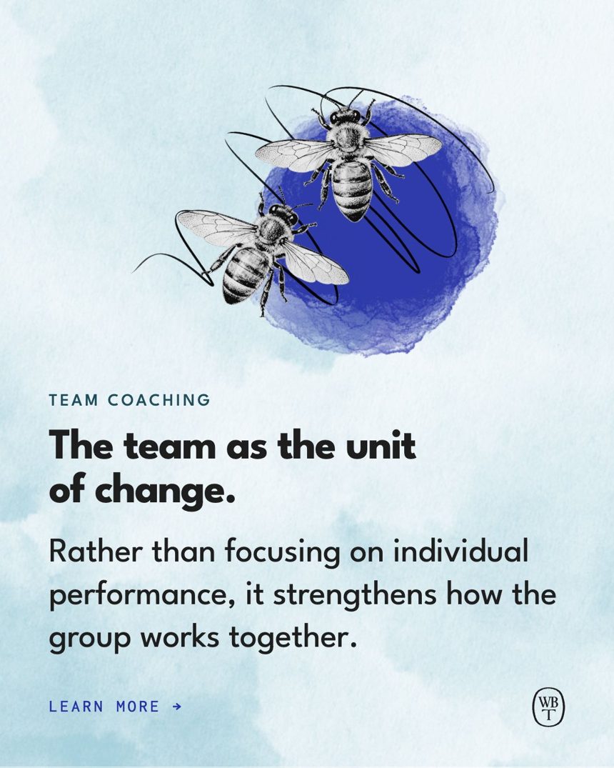
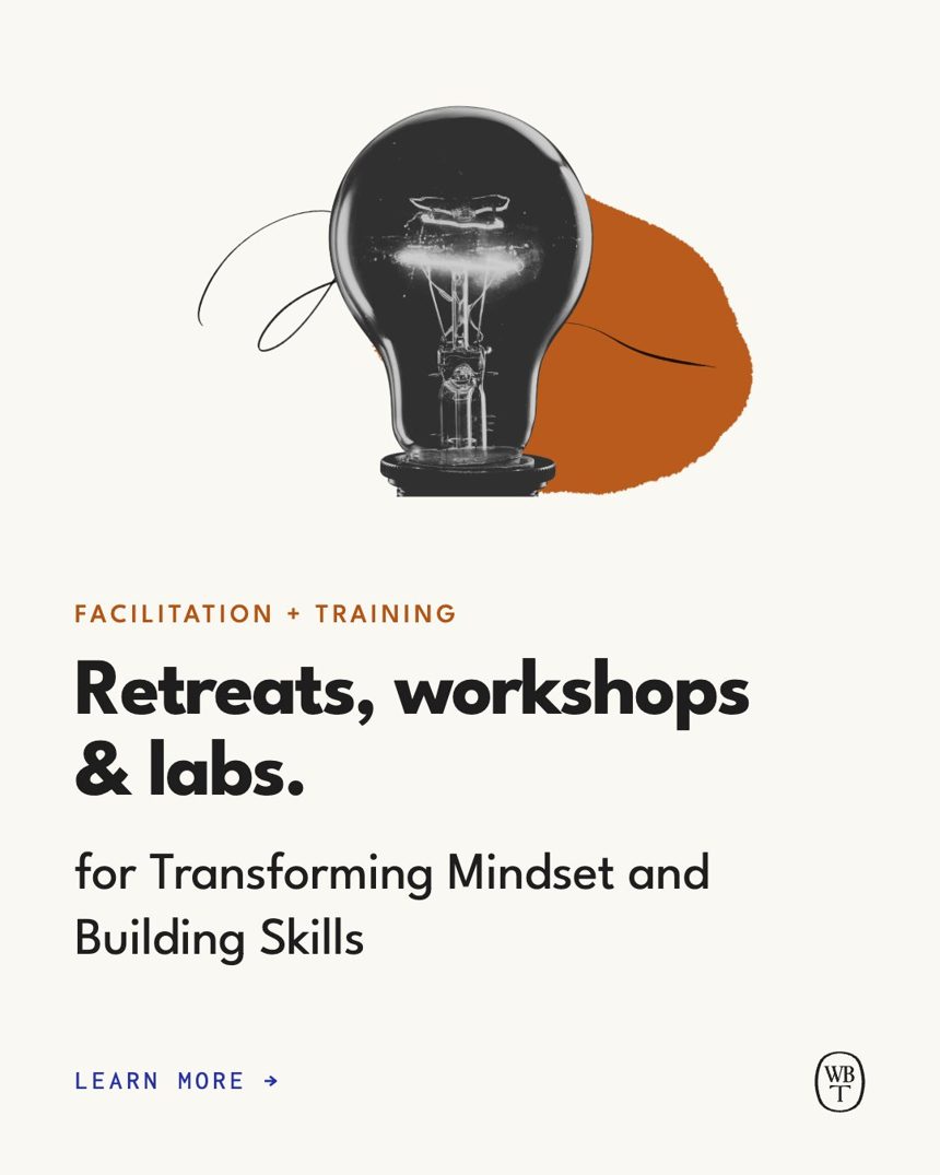
Testimonials
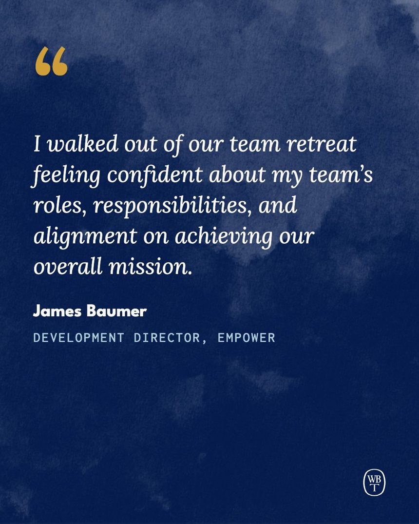
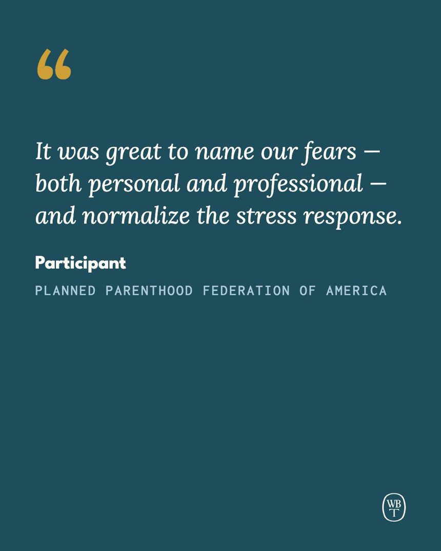
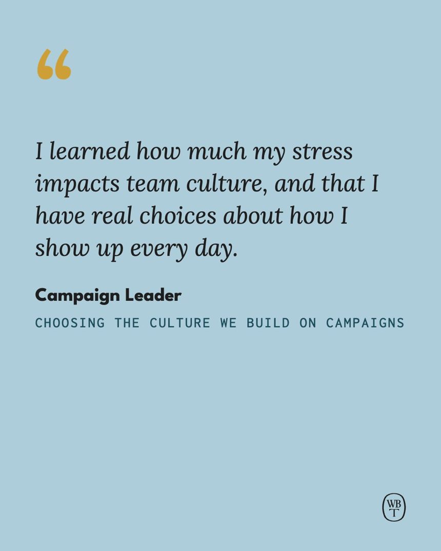
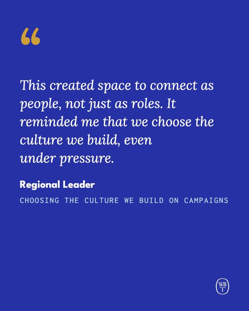
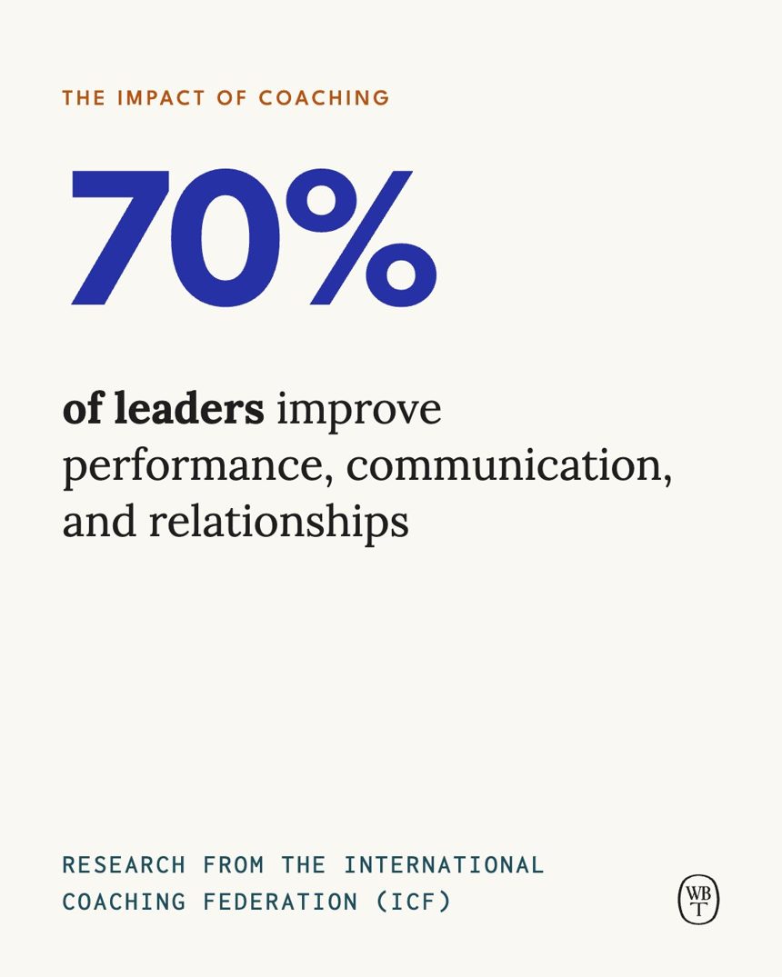
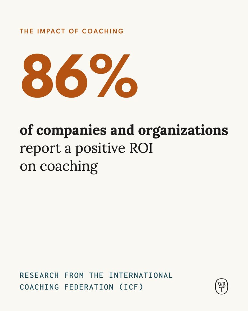
Stats
Resources
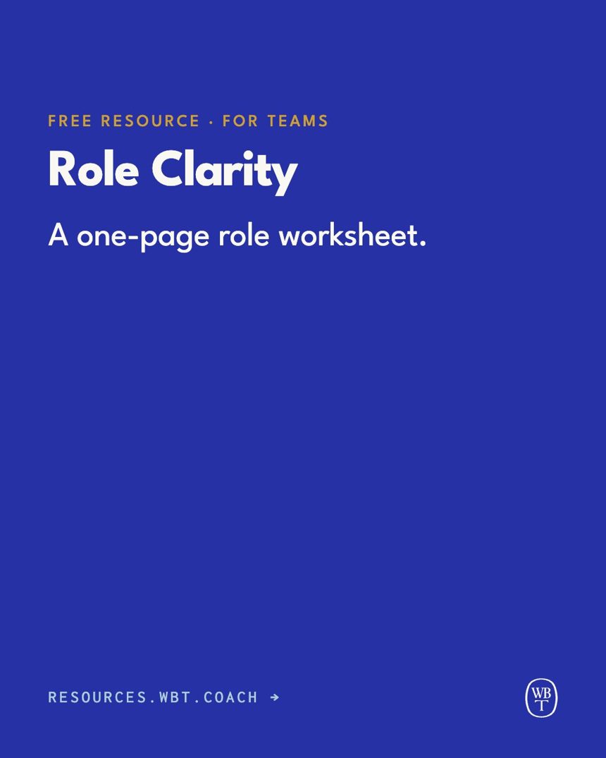
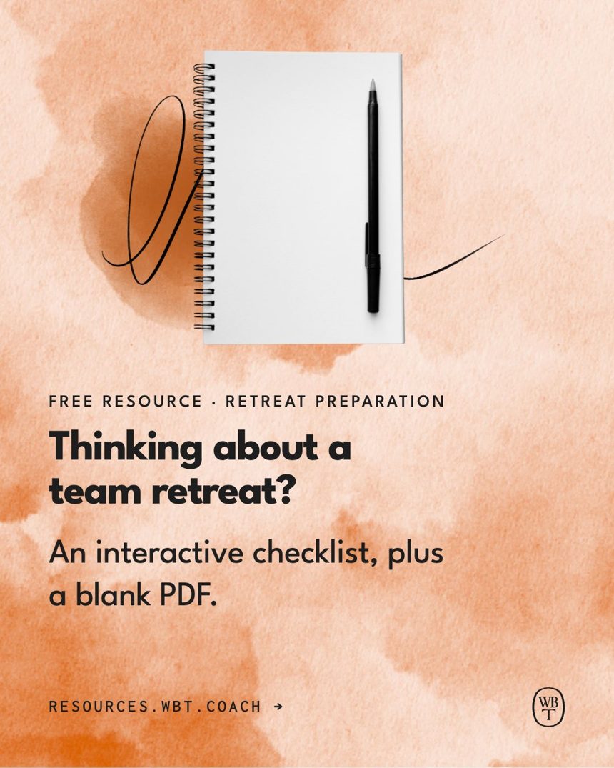
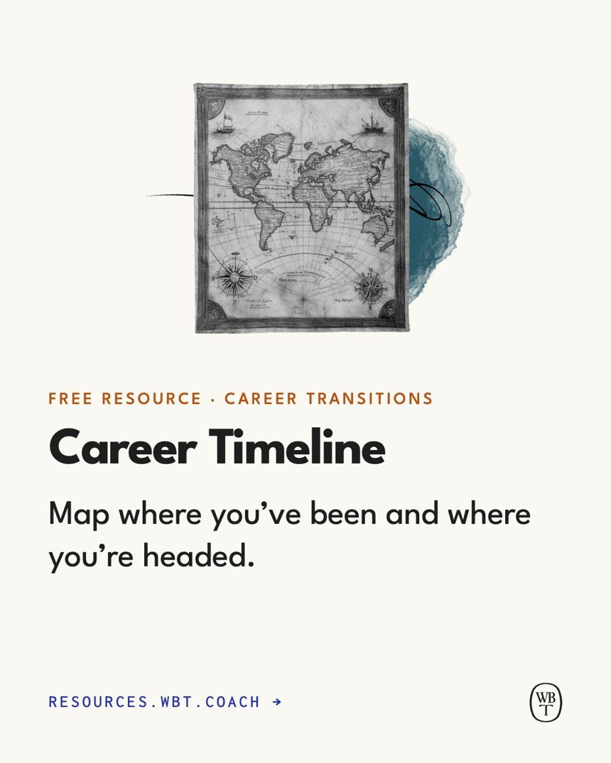
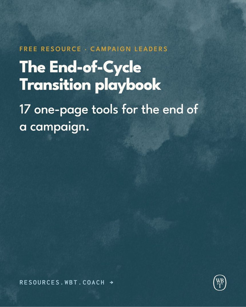
Insights
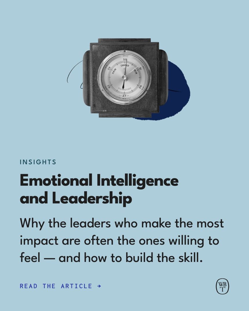
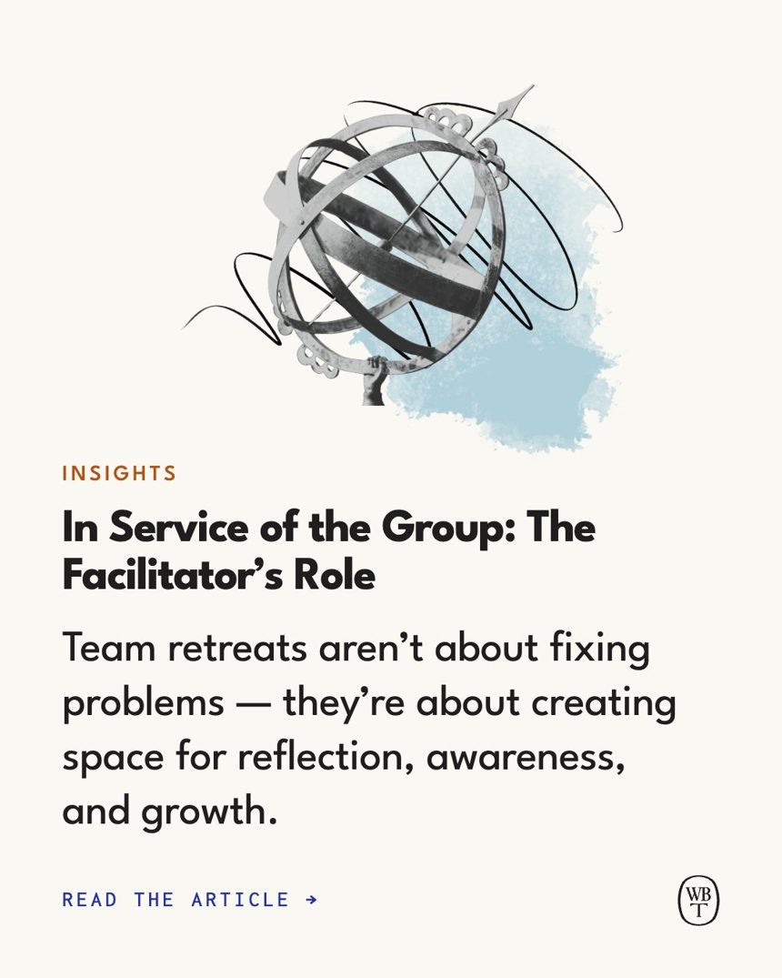
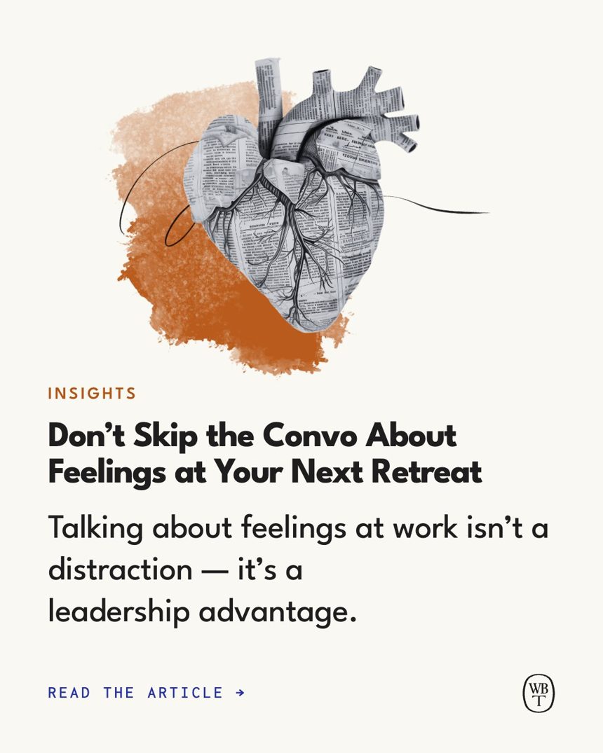
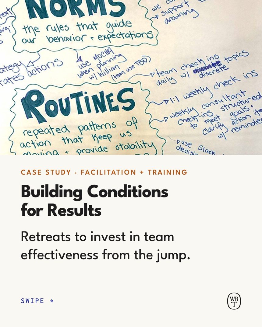
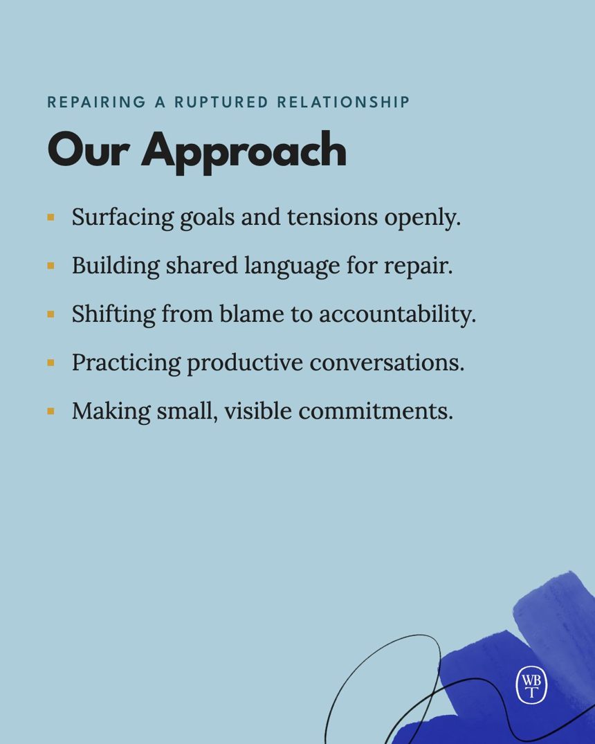
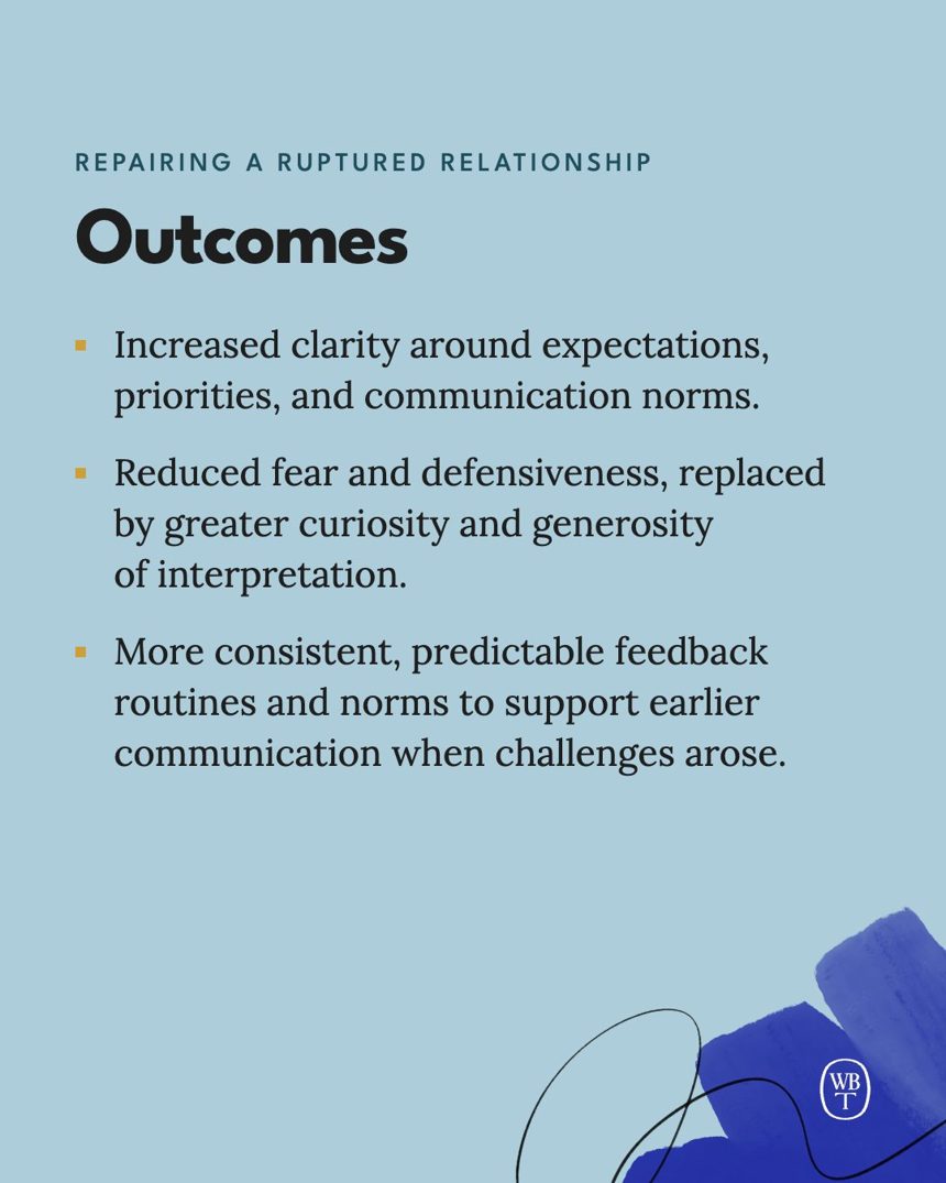
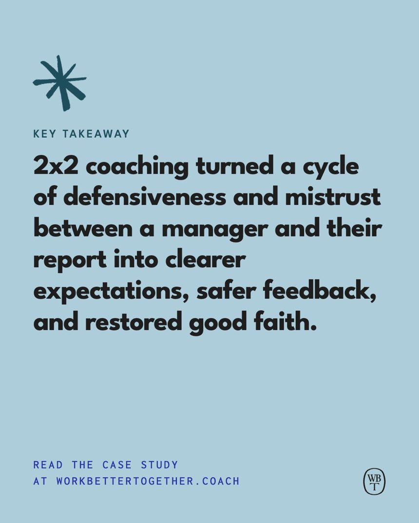
Every case study on our site becomes a carousel that walks through its beats: the photo and title, The Challenge, Our Approach, what shifted, the client in their own words, and the key takeaway. Where a case study tells a beat in prose rather than a list, the slide uses its opening sentences, word for word. Each tile pages through its slides, as on Instagram: swipe, or hover for the arrows.
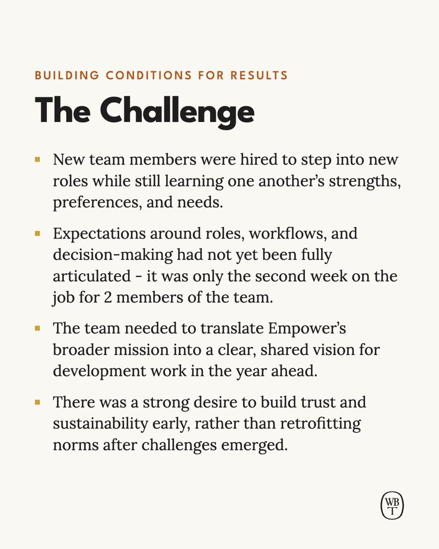
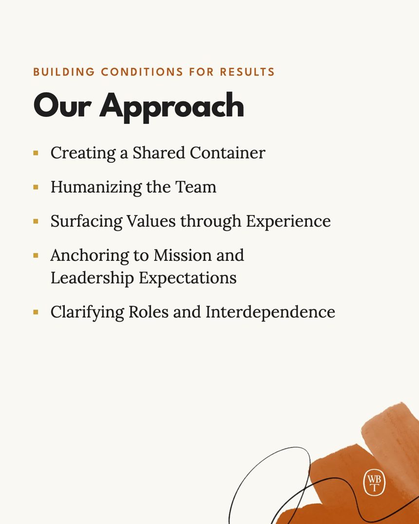
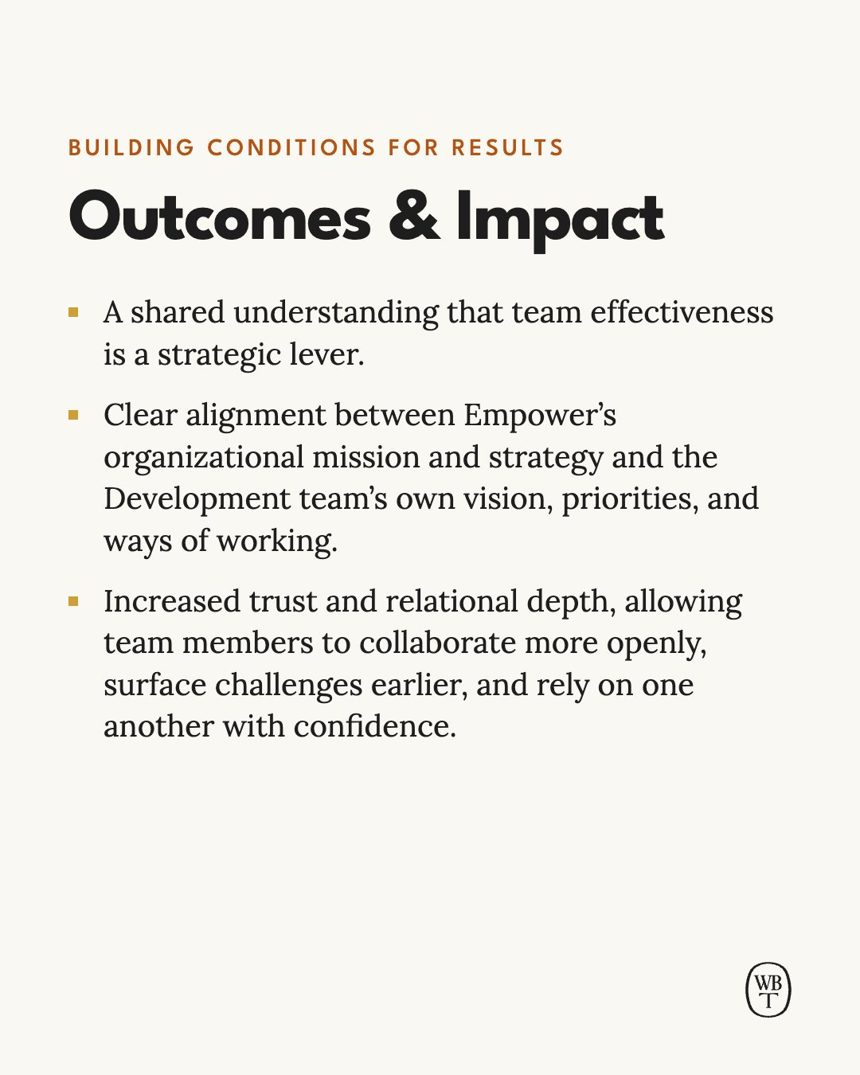
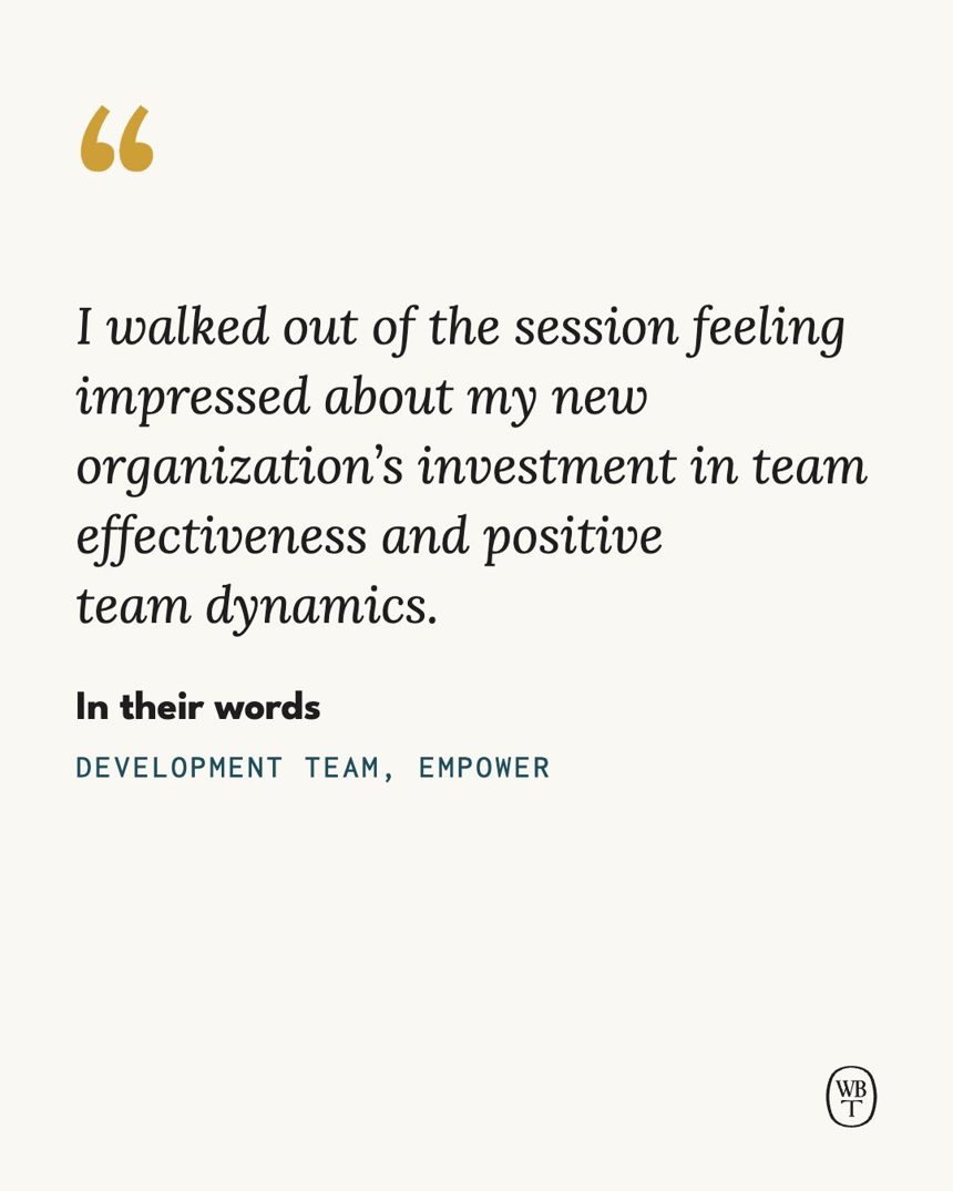
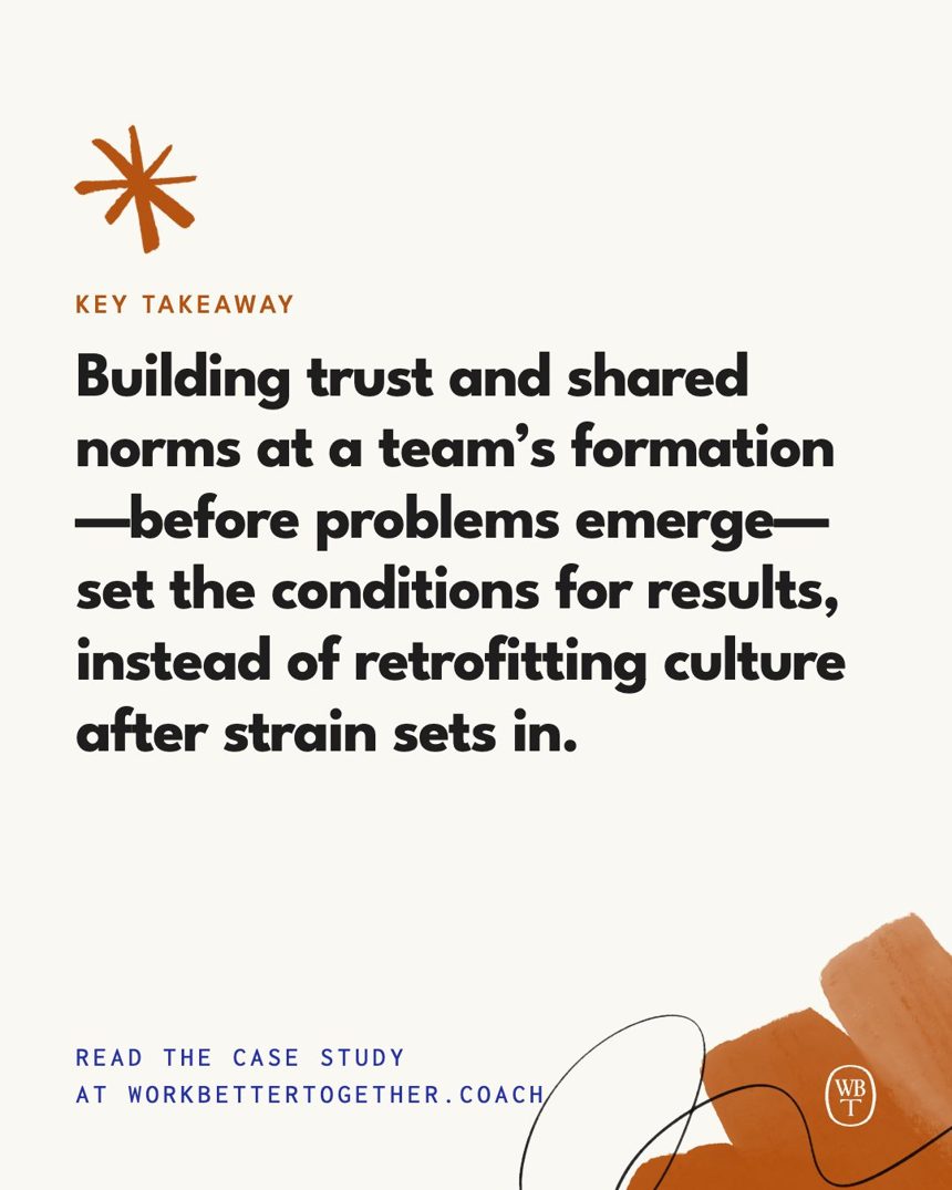
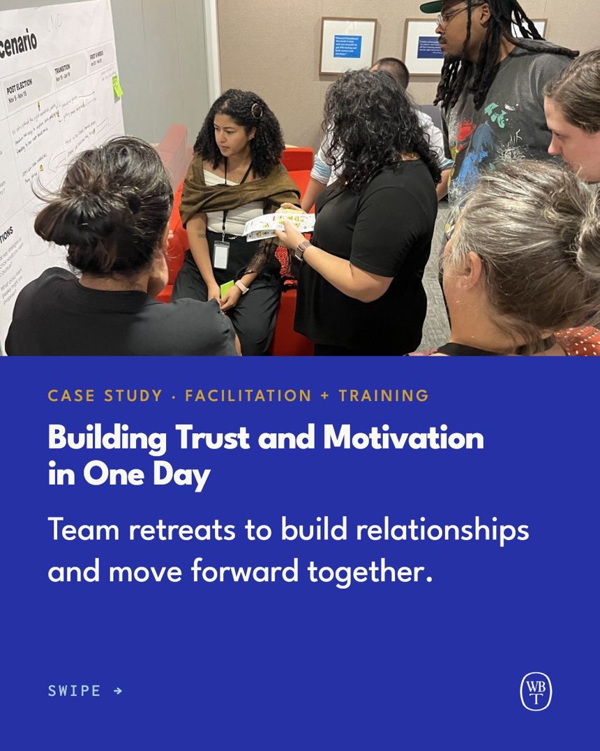
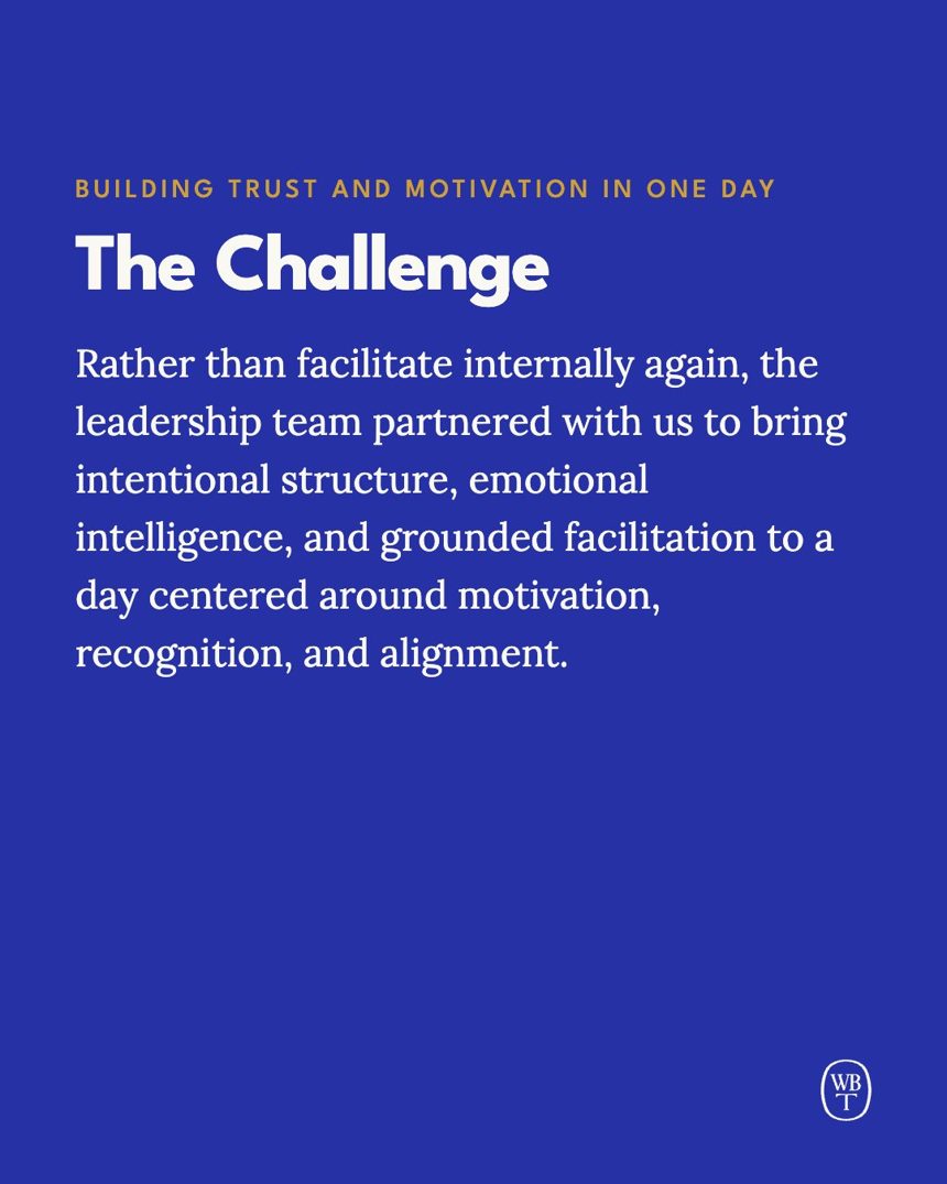
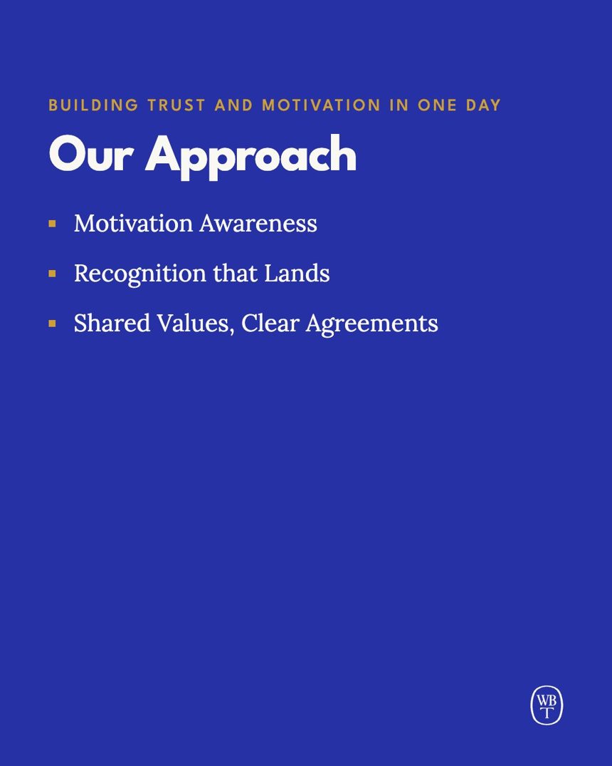
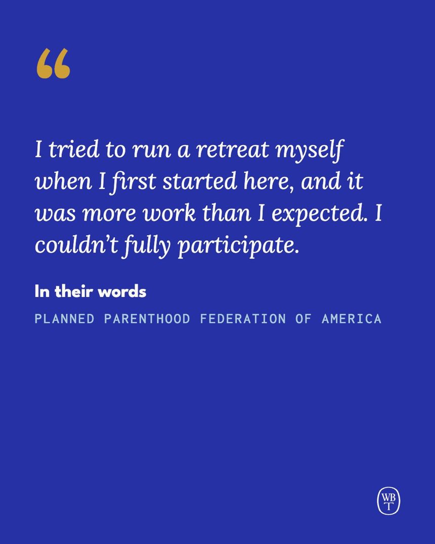
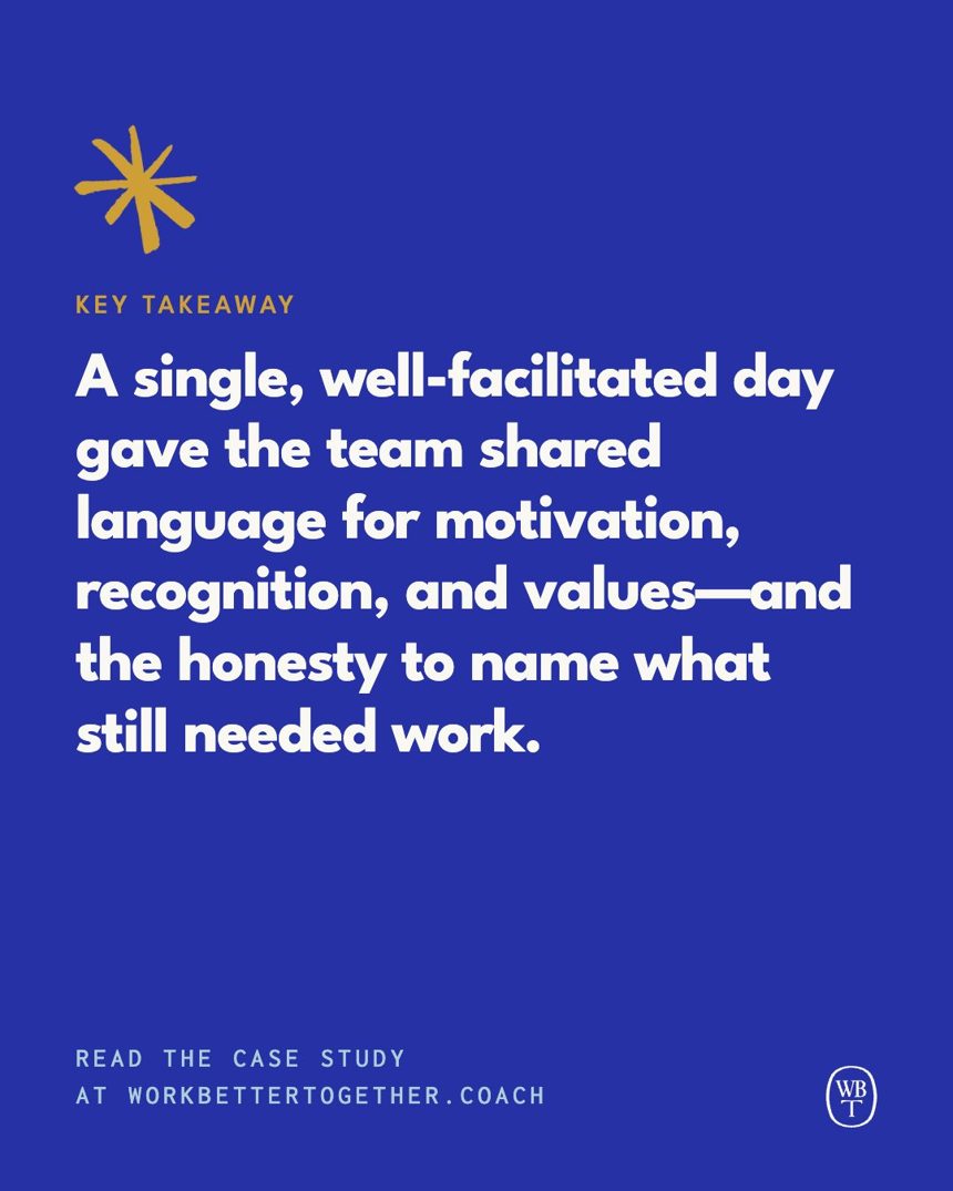
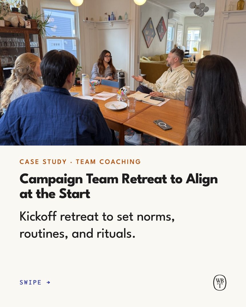
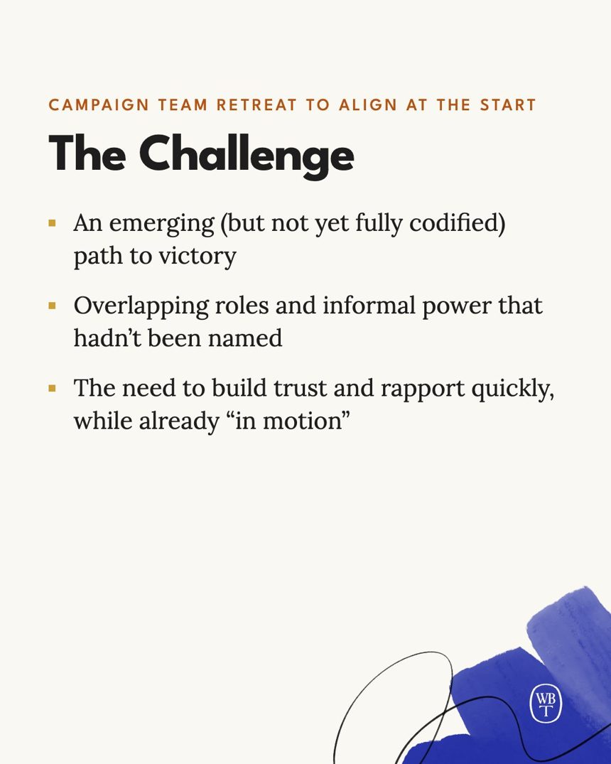
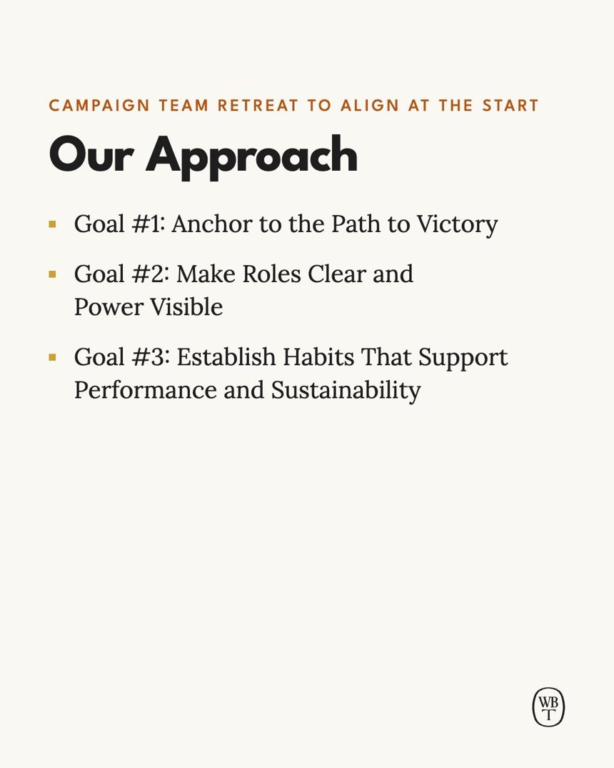
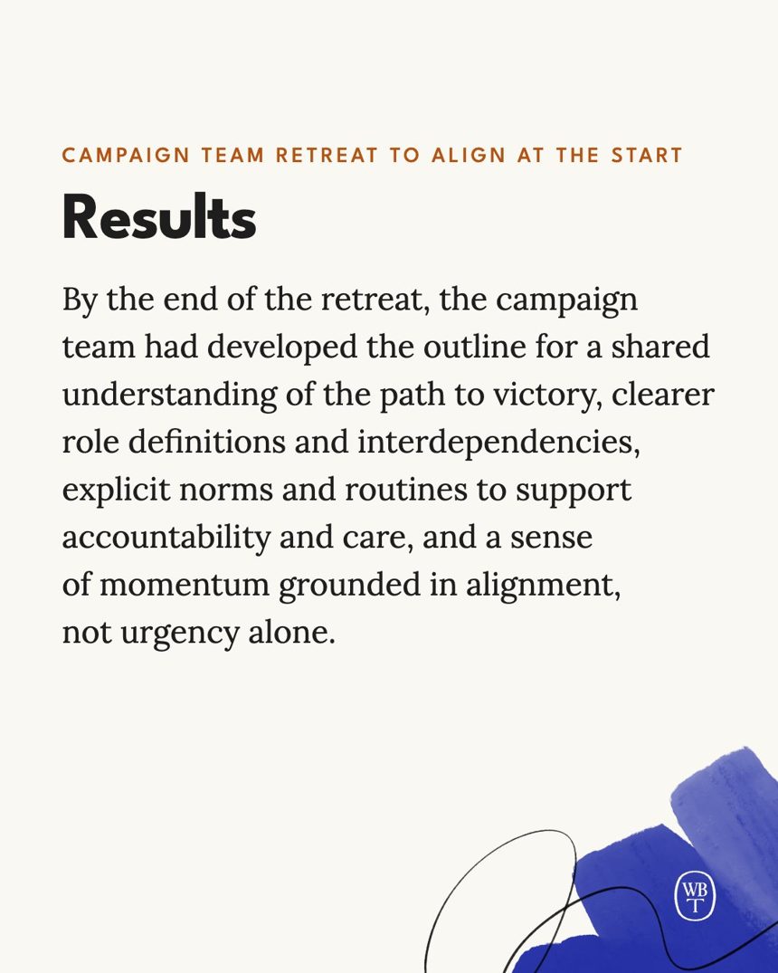
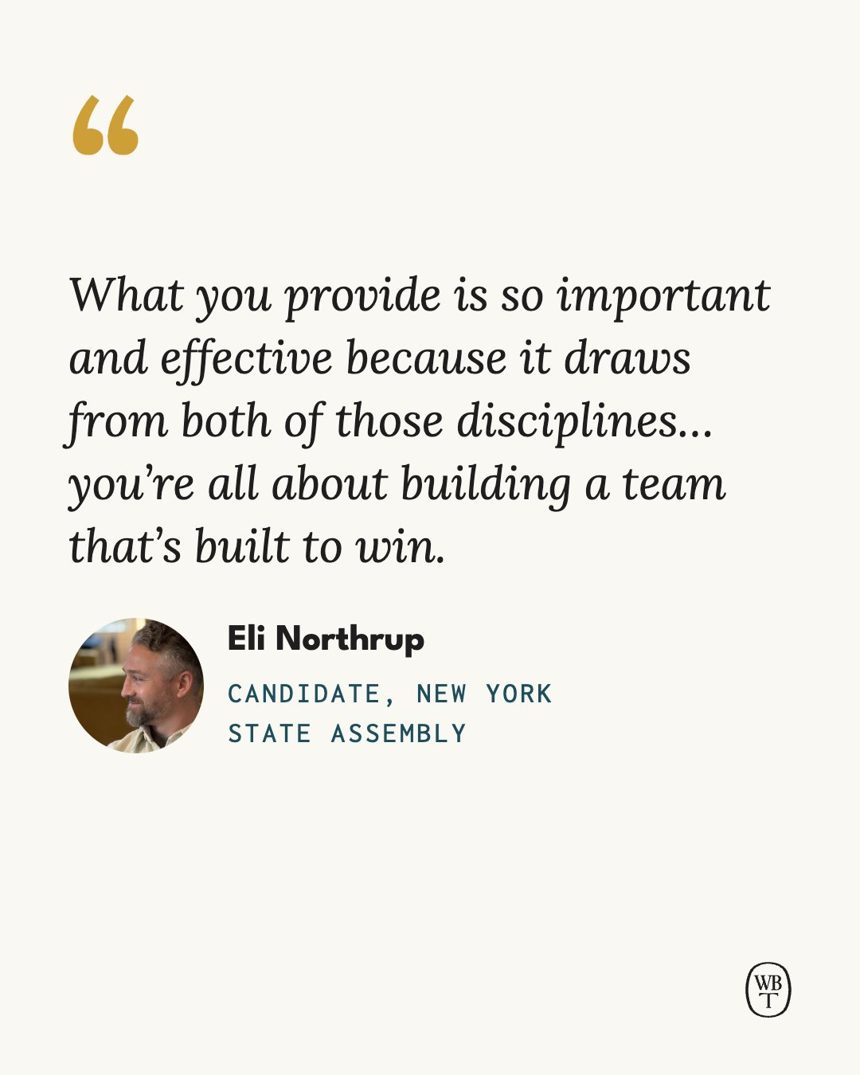
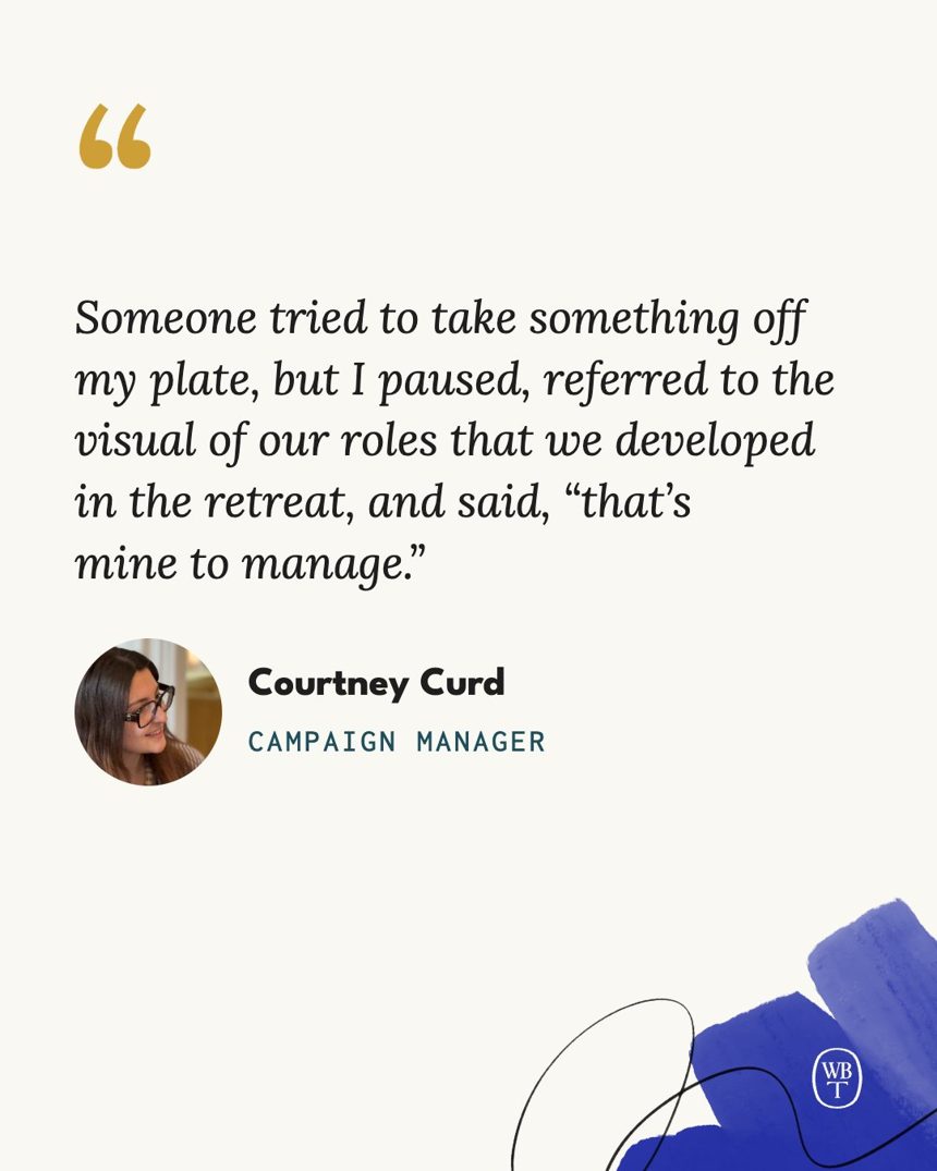
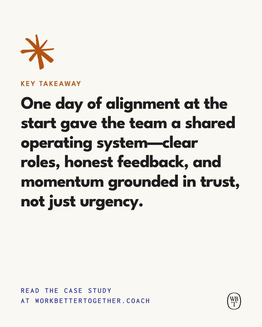
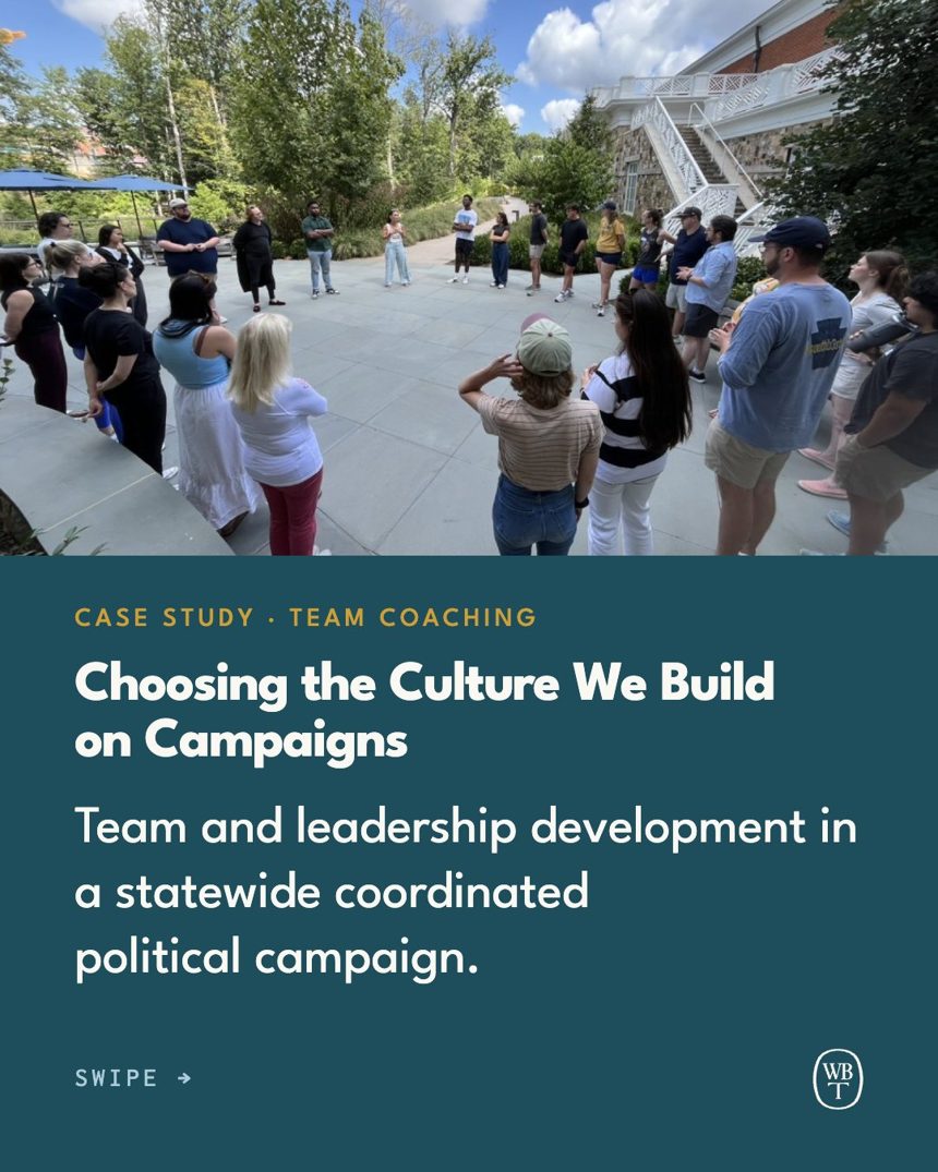
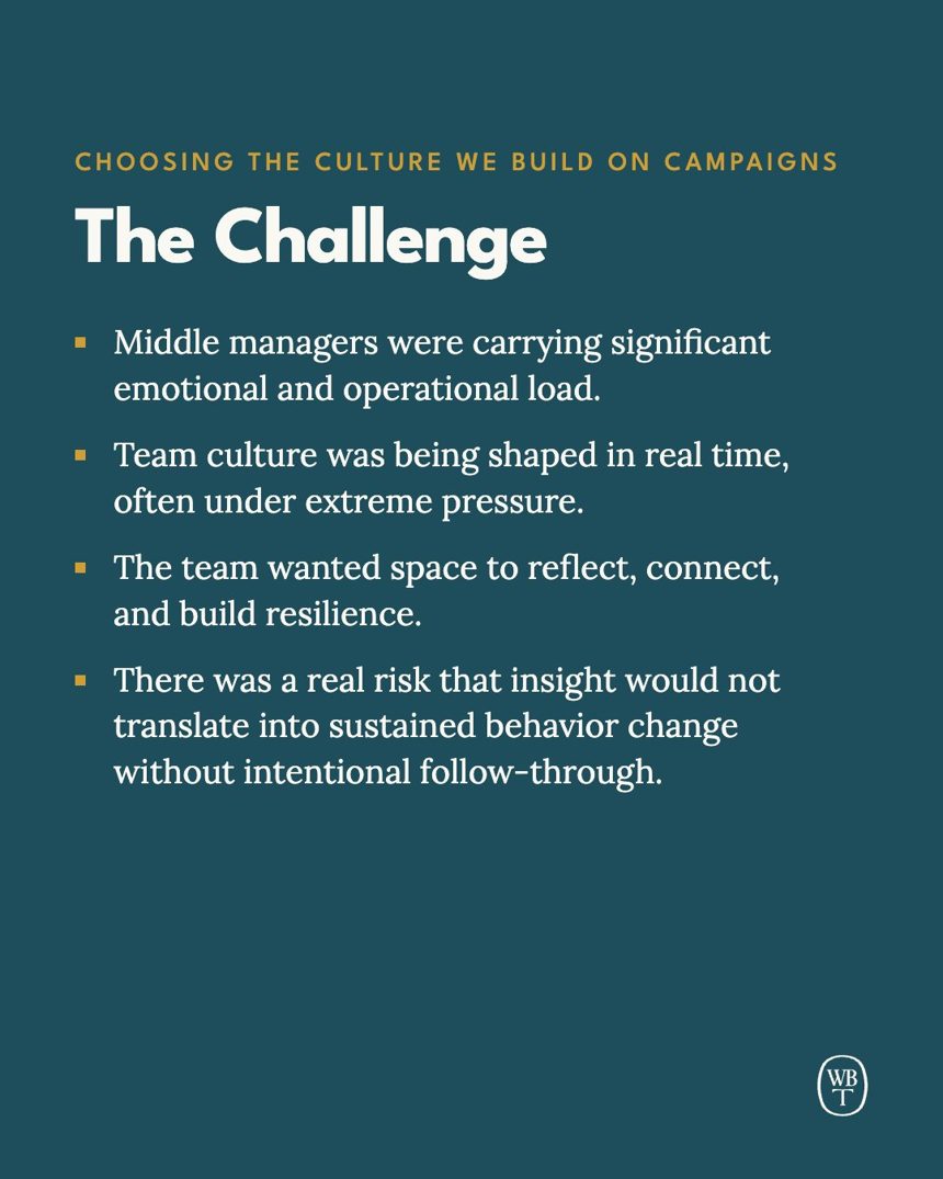
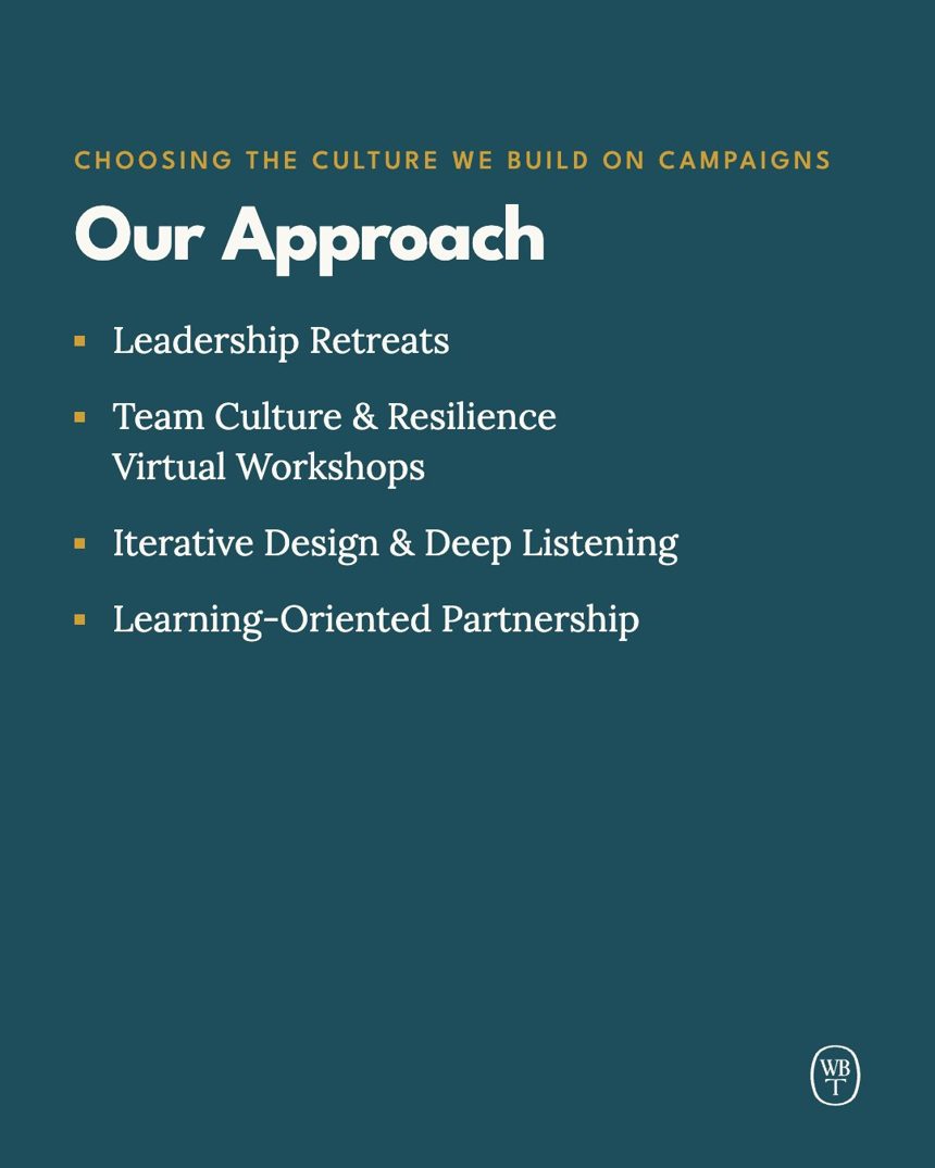
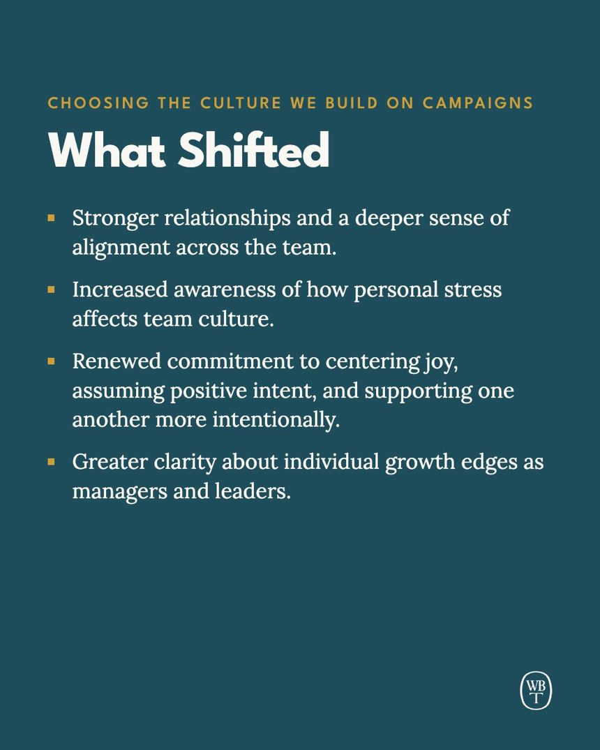
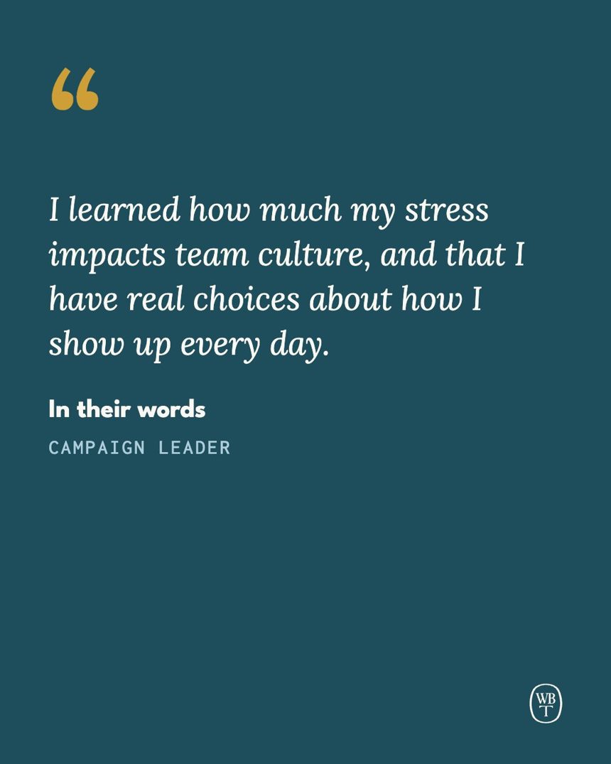
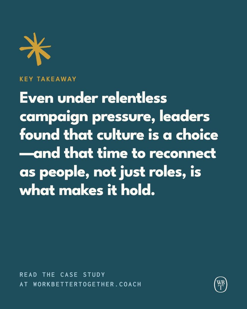
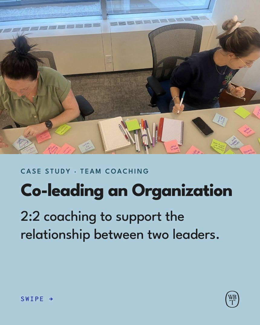
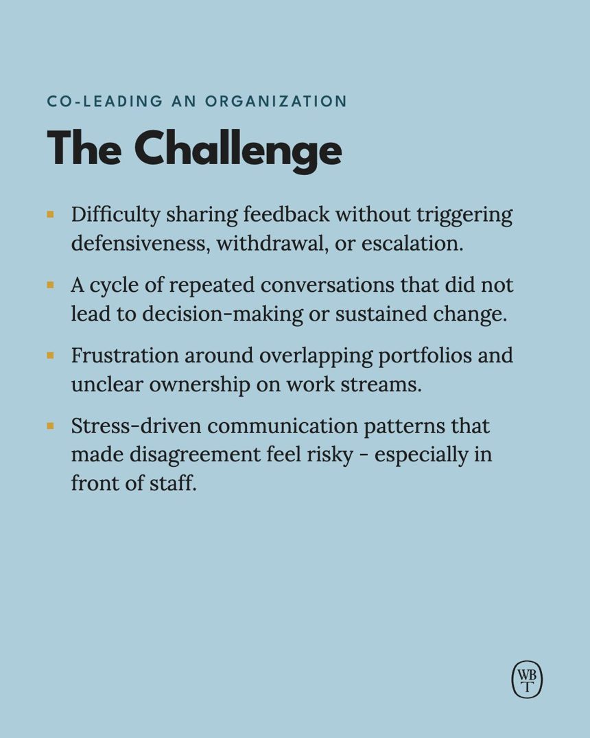
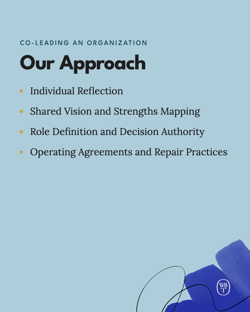
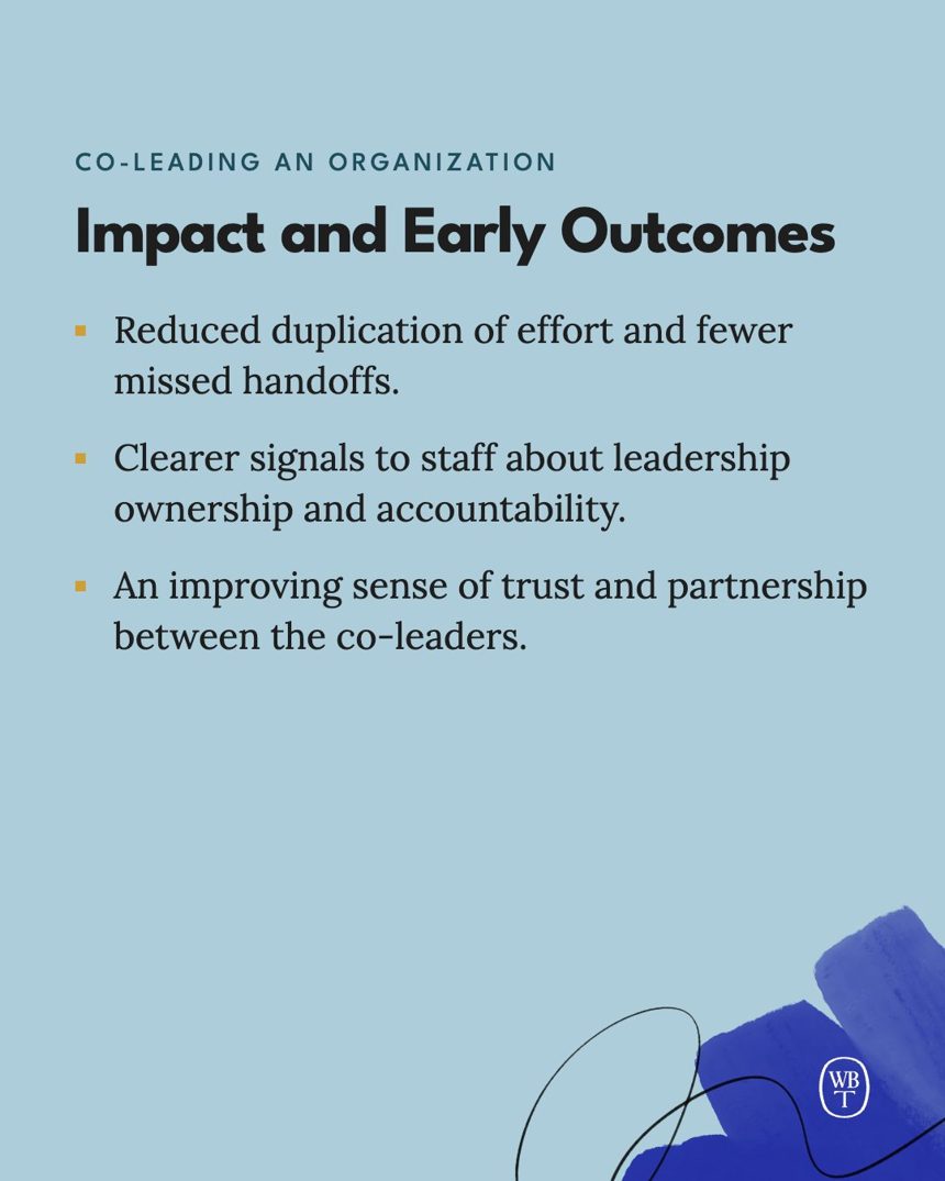
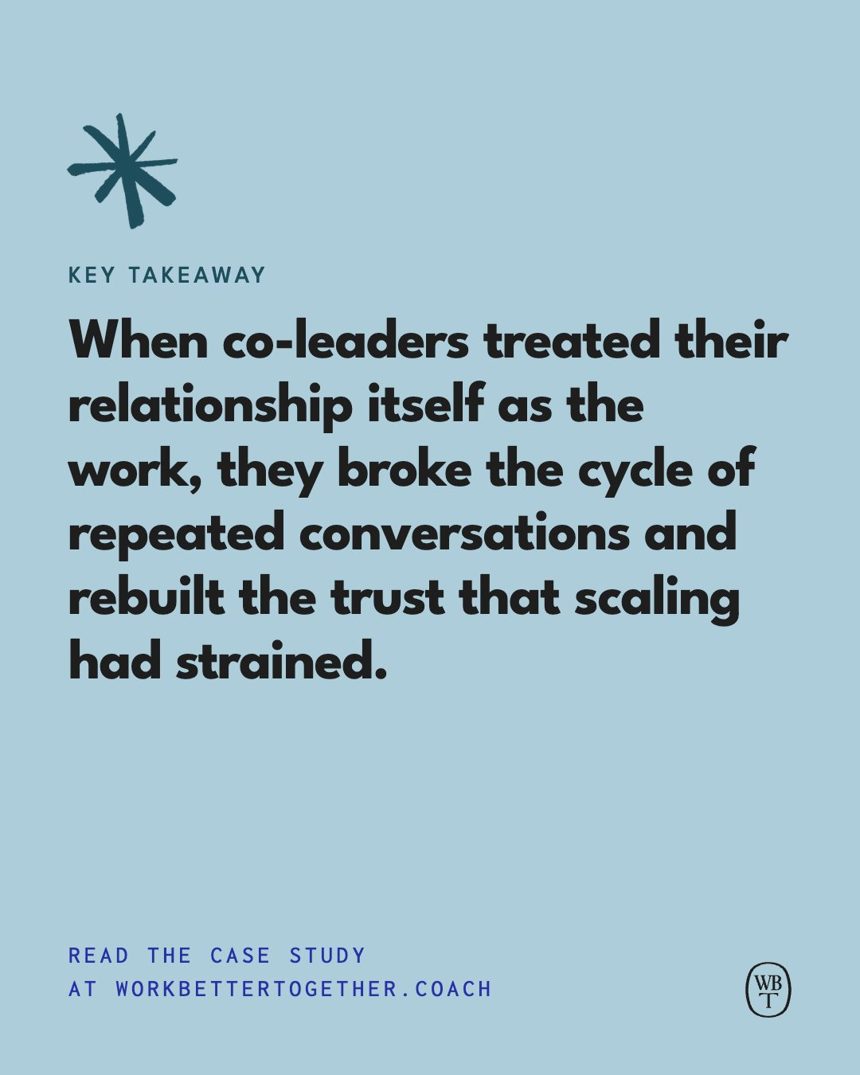
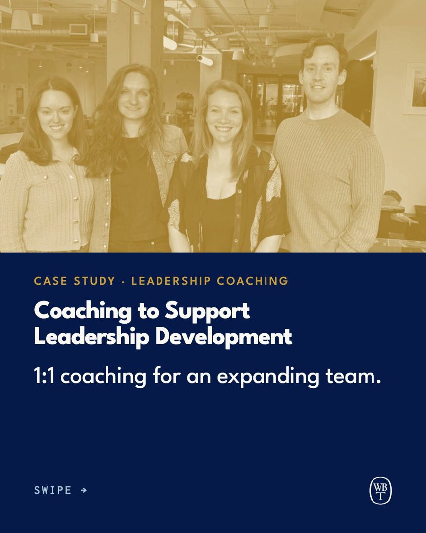
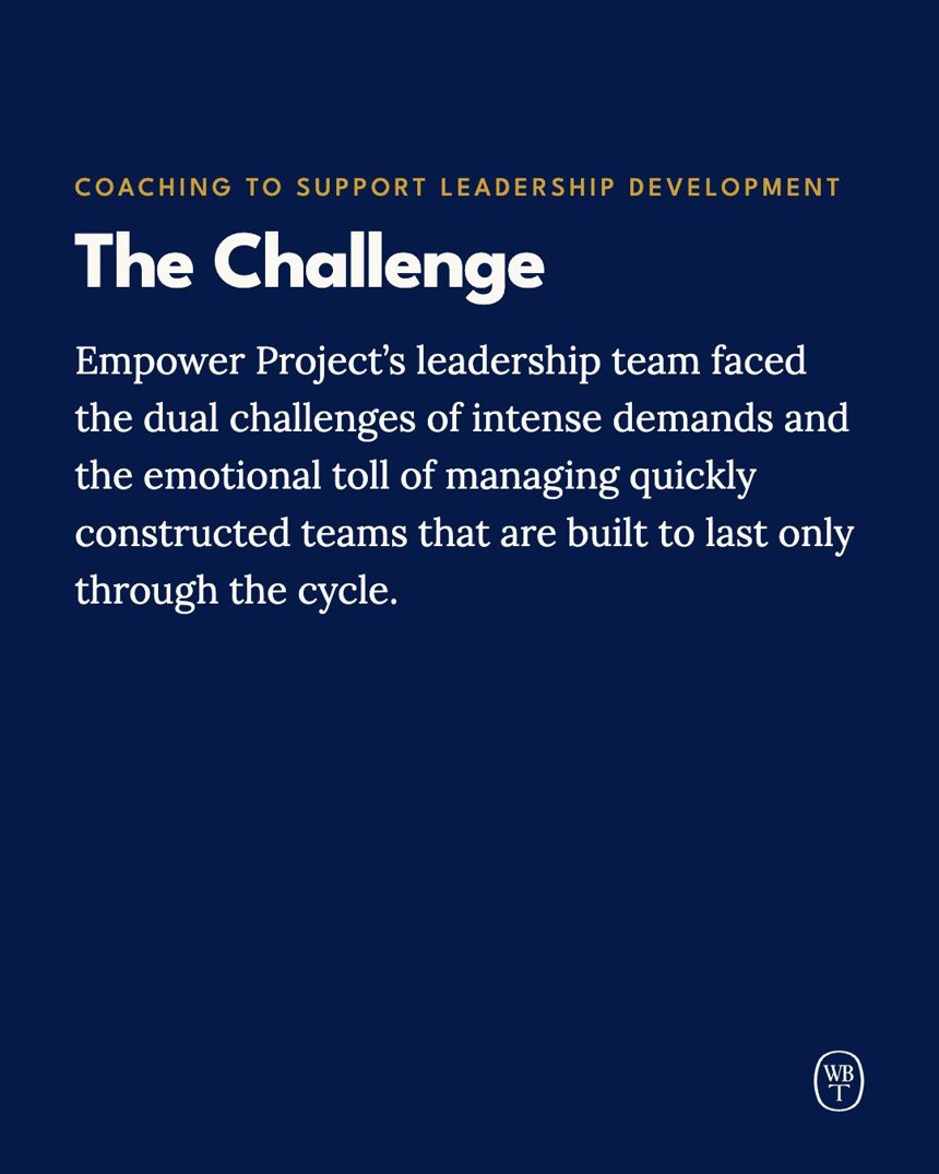
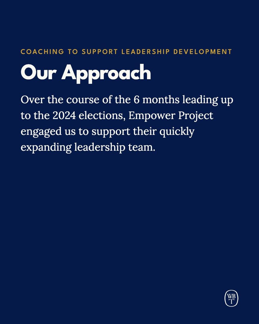
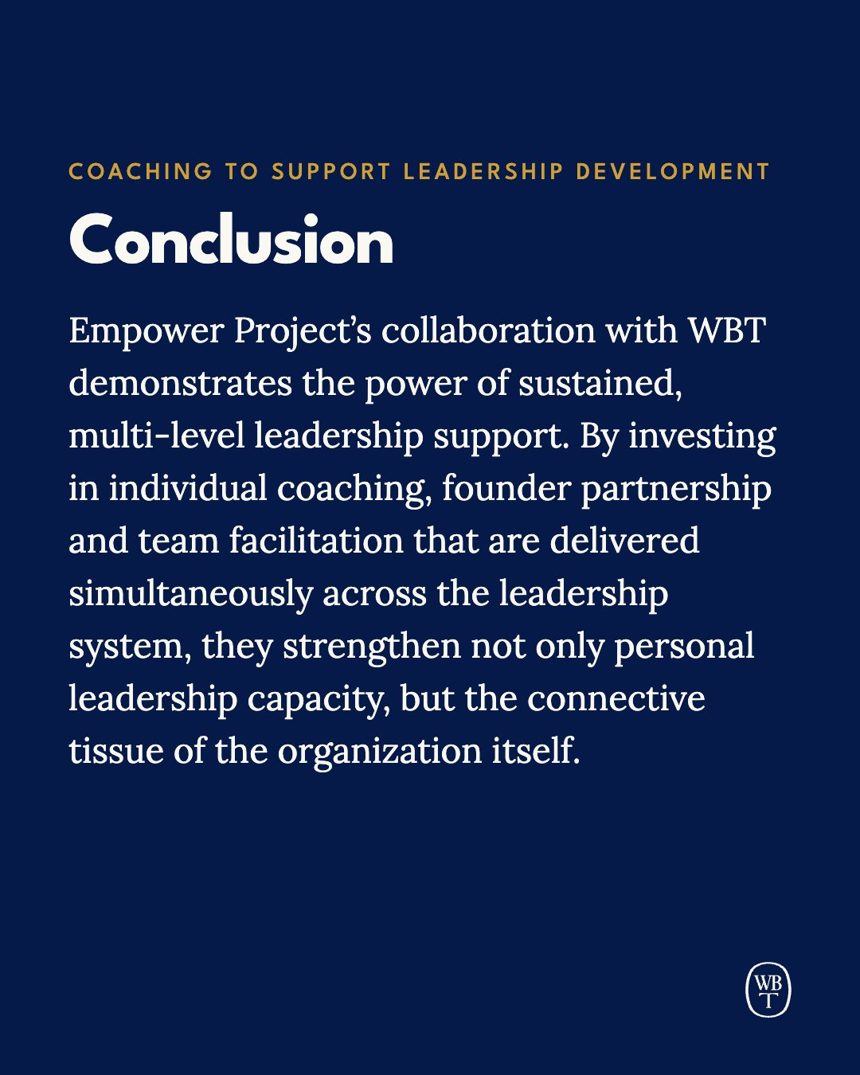
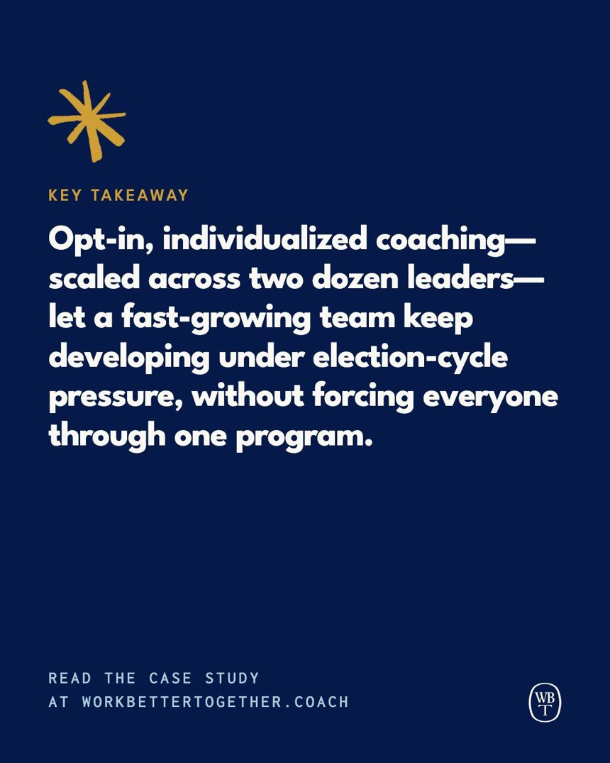
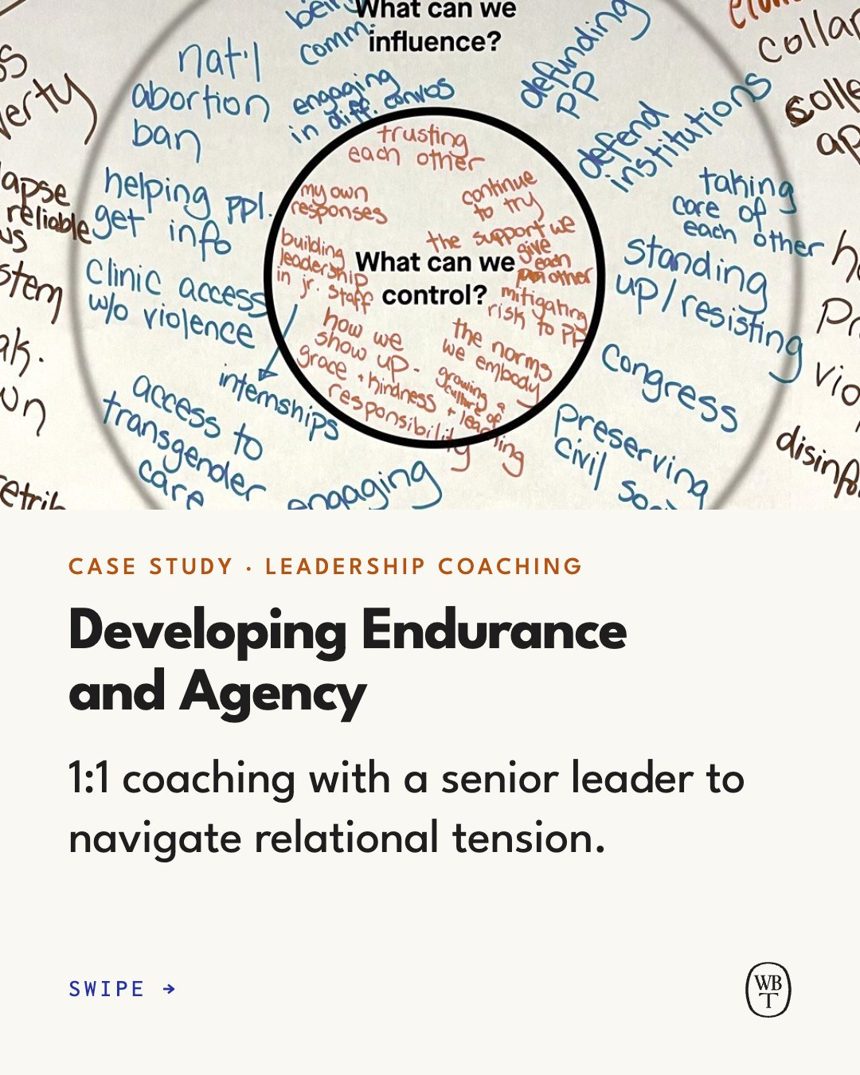
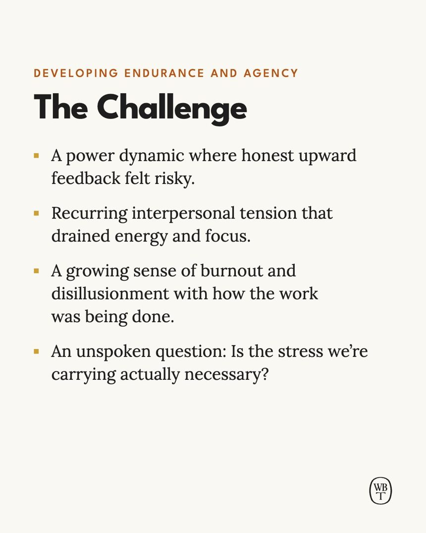
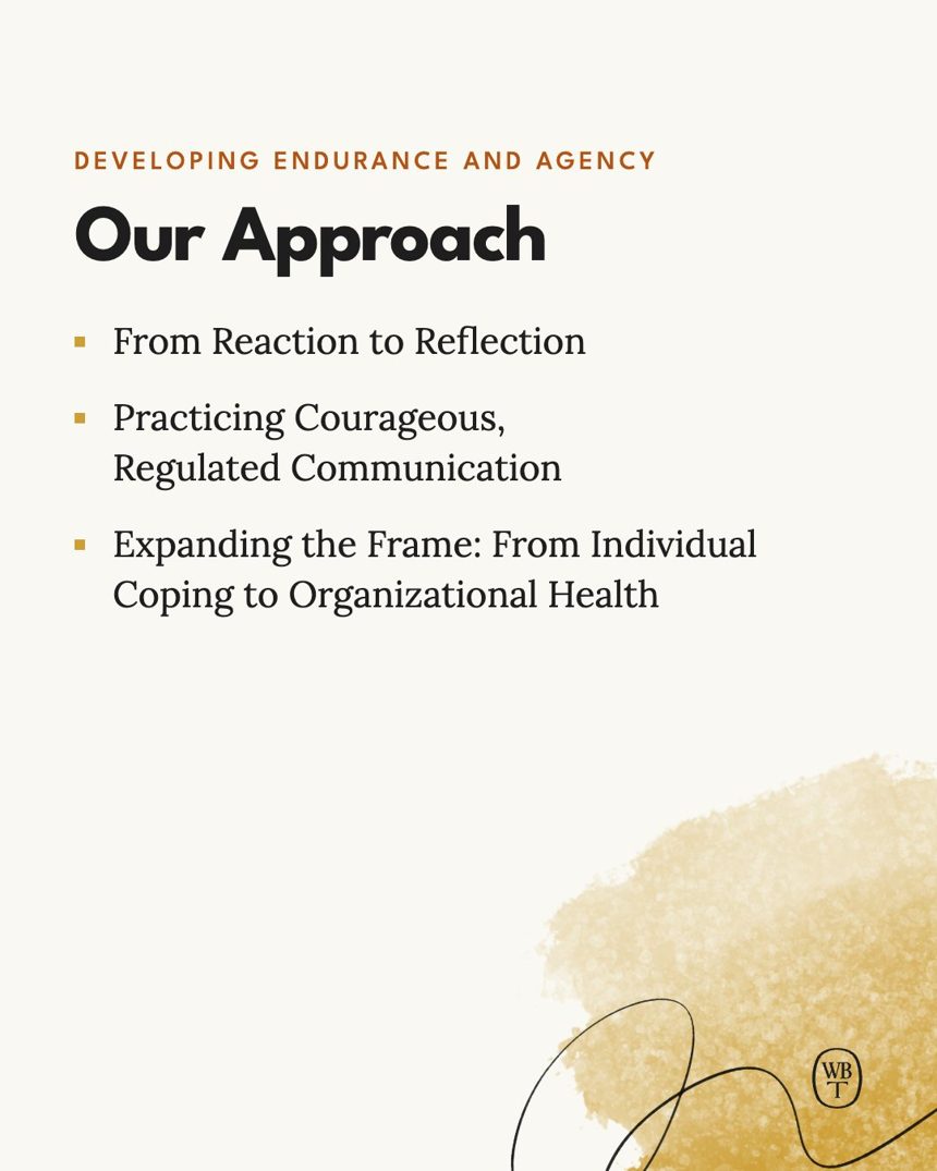
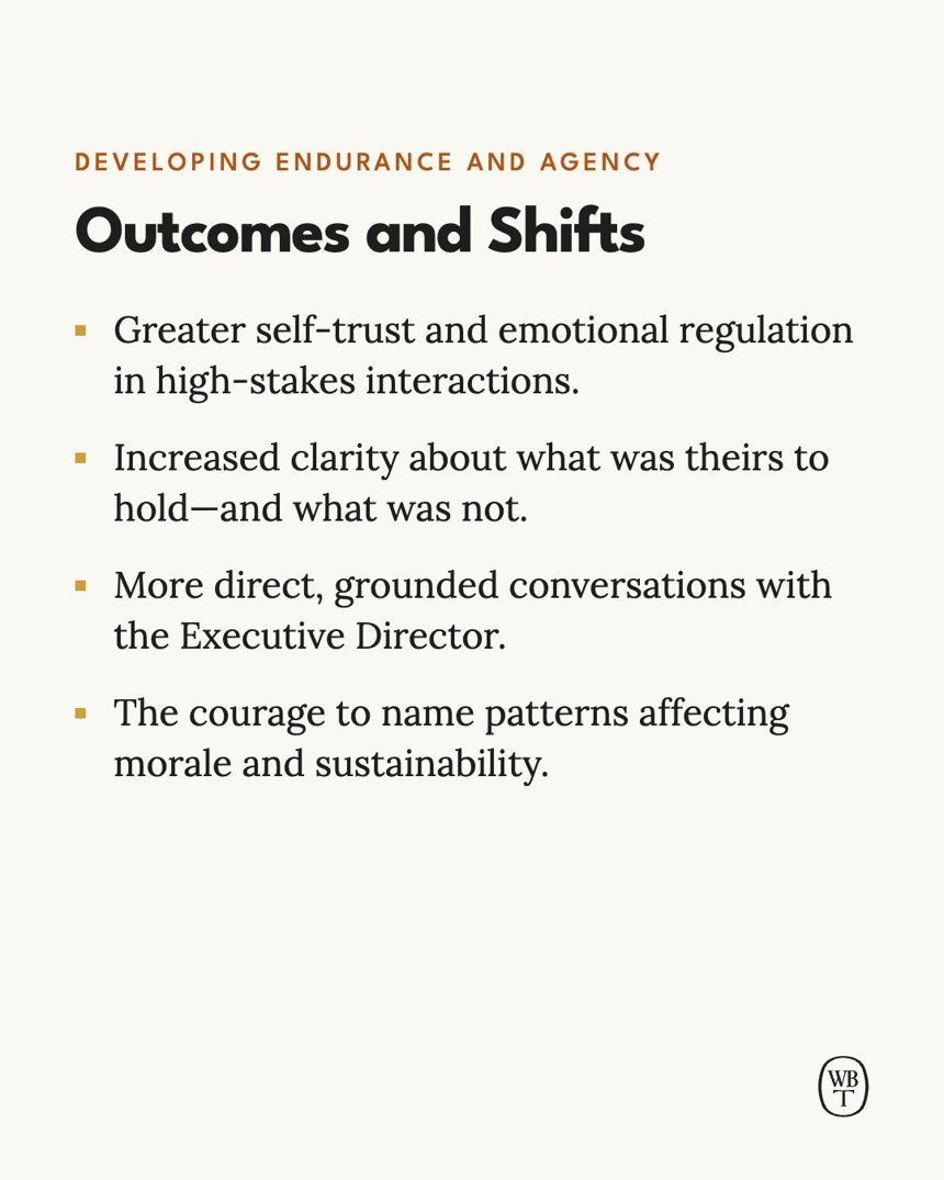
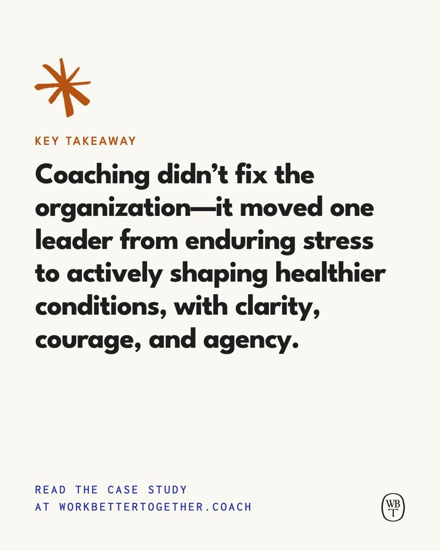
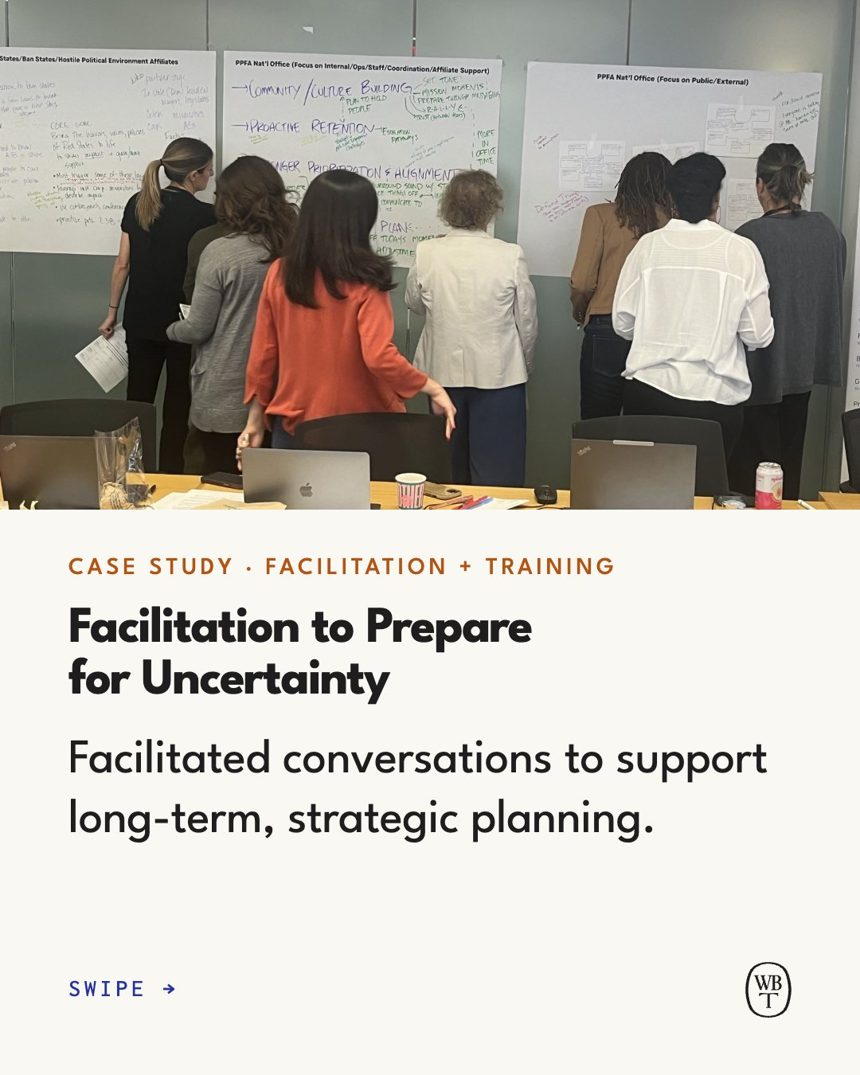
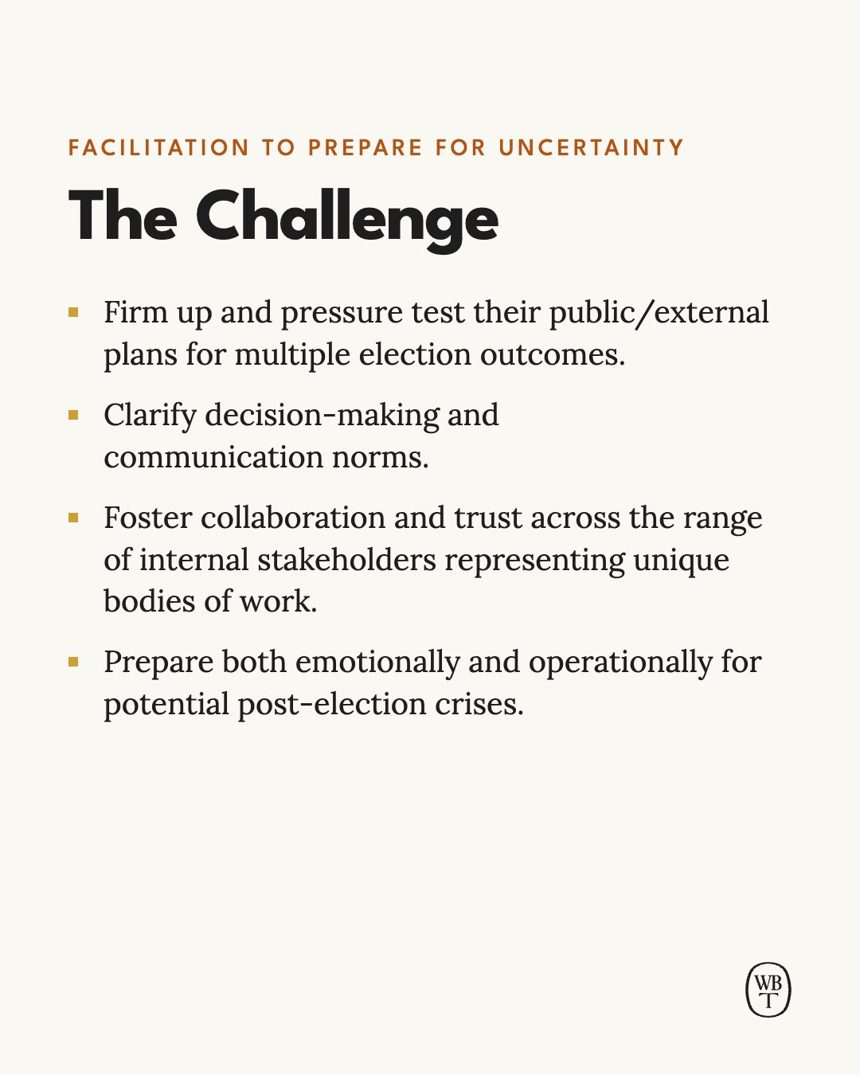
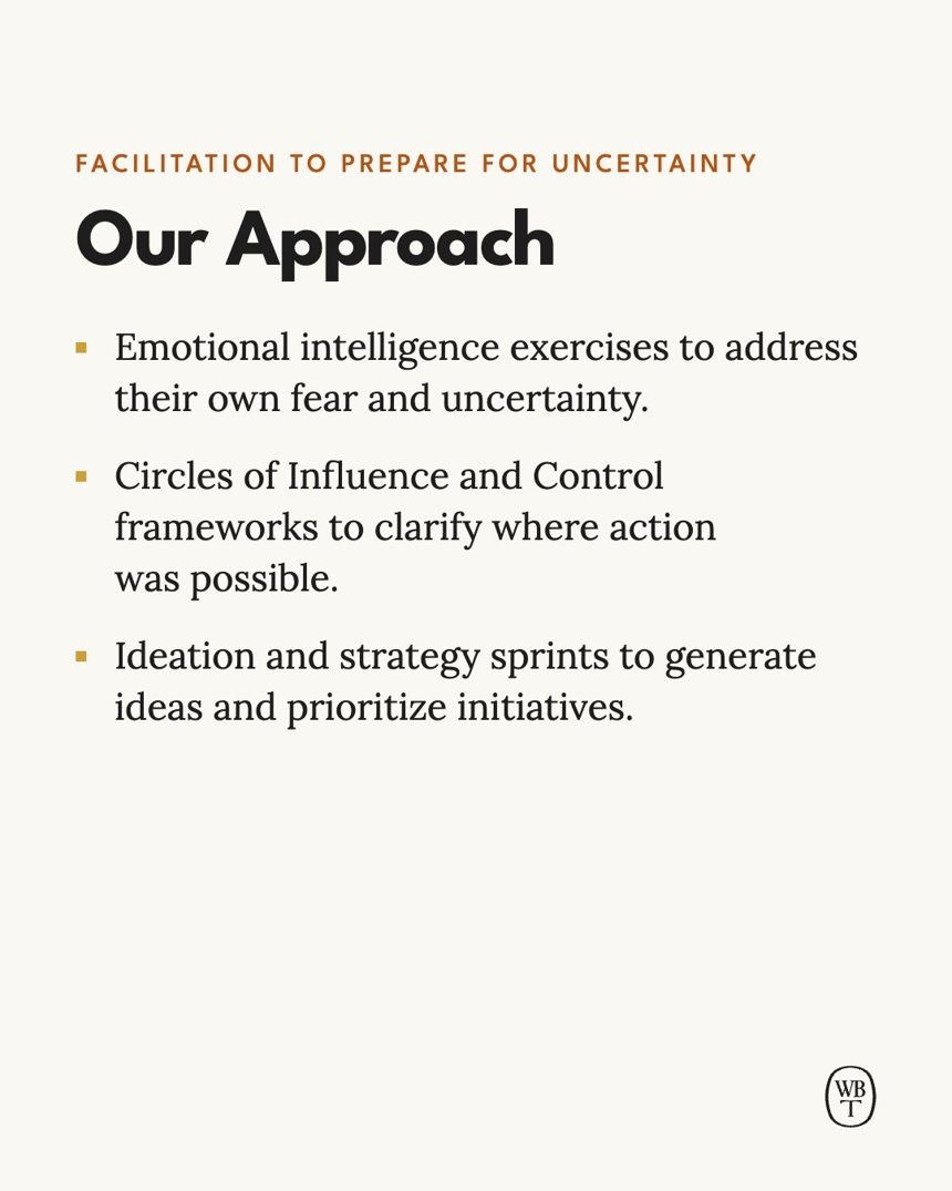
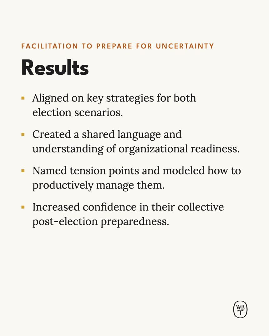
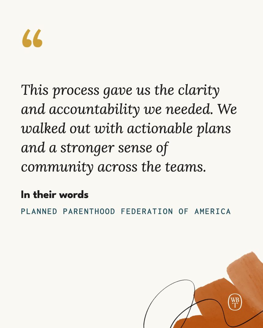
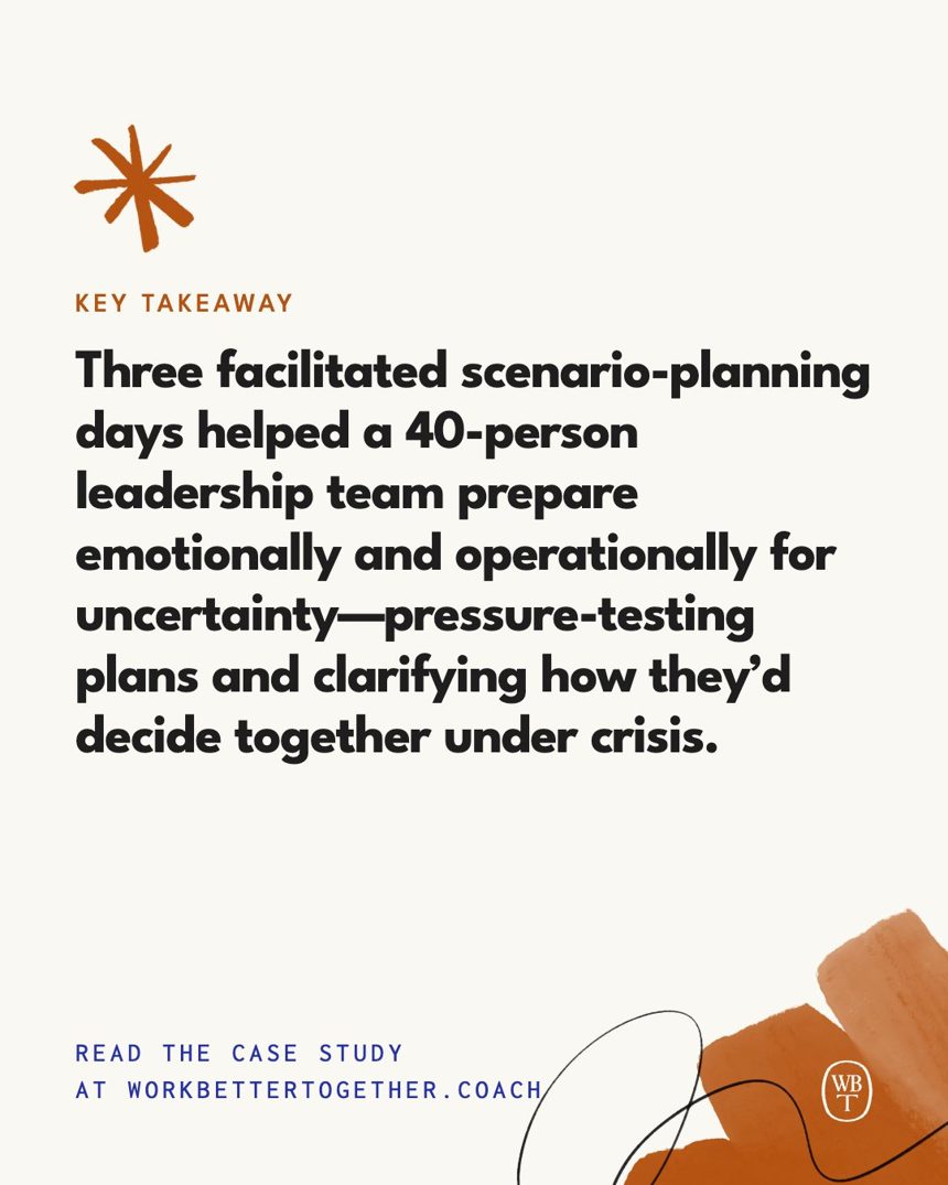
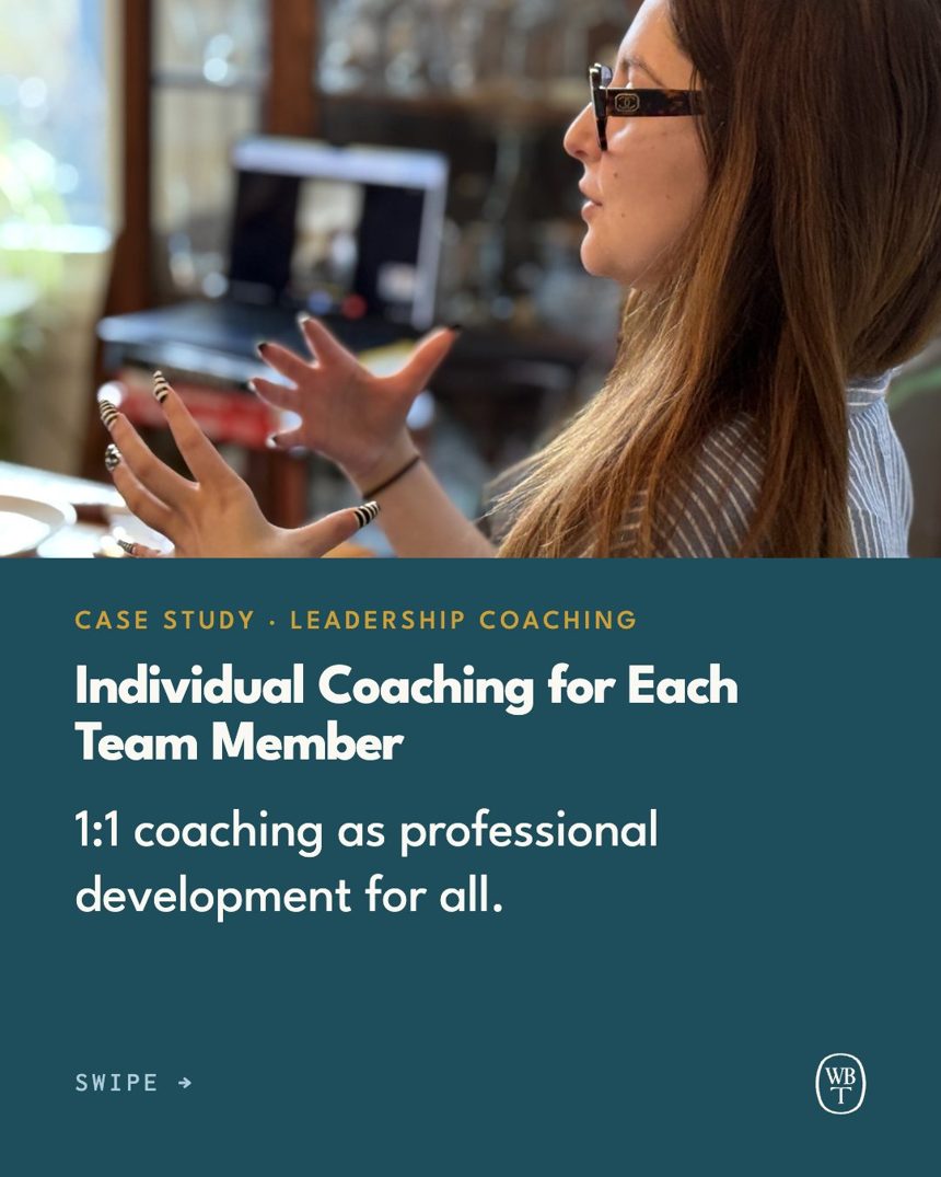
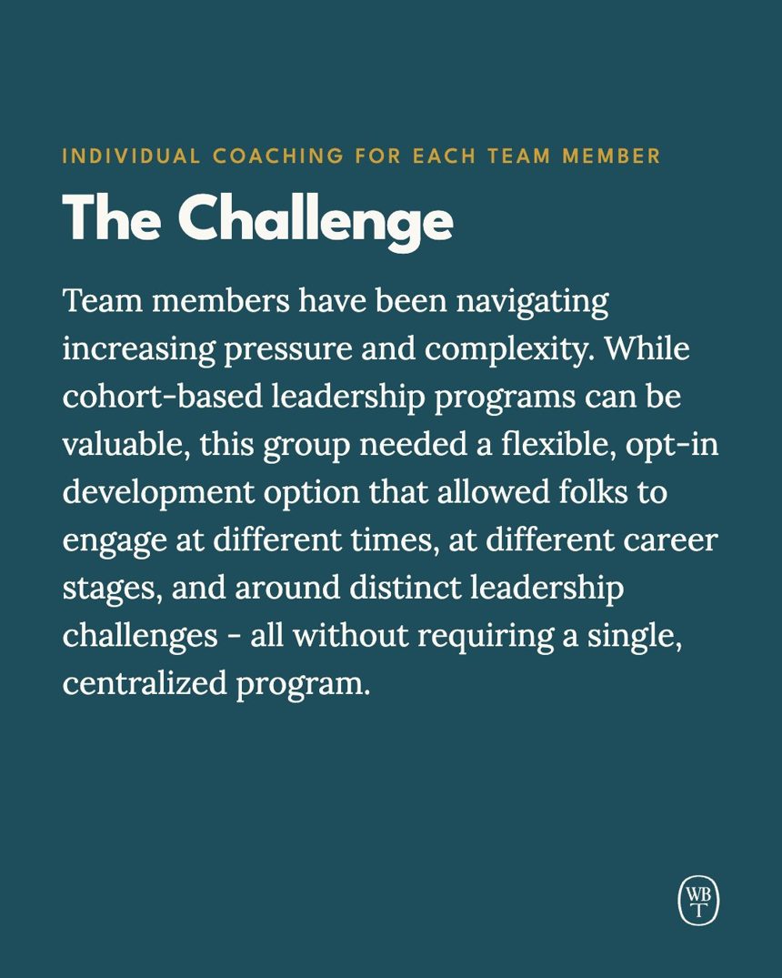
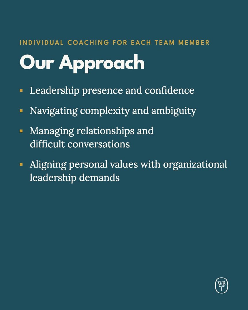
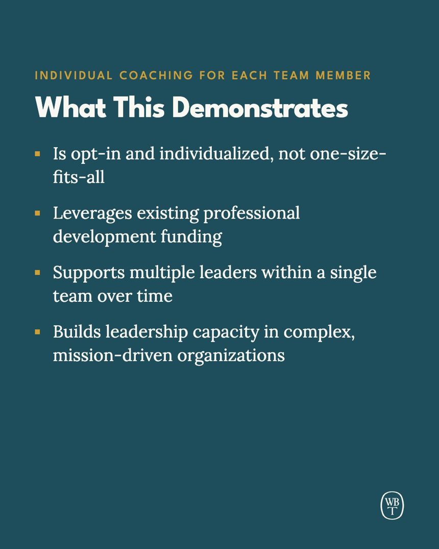
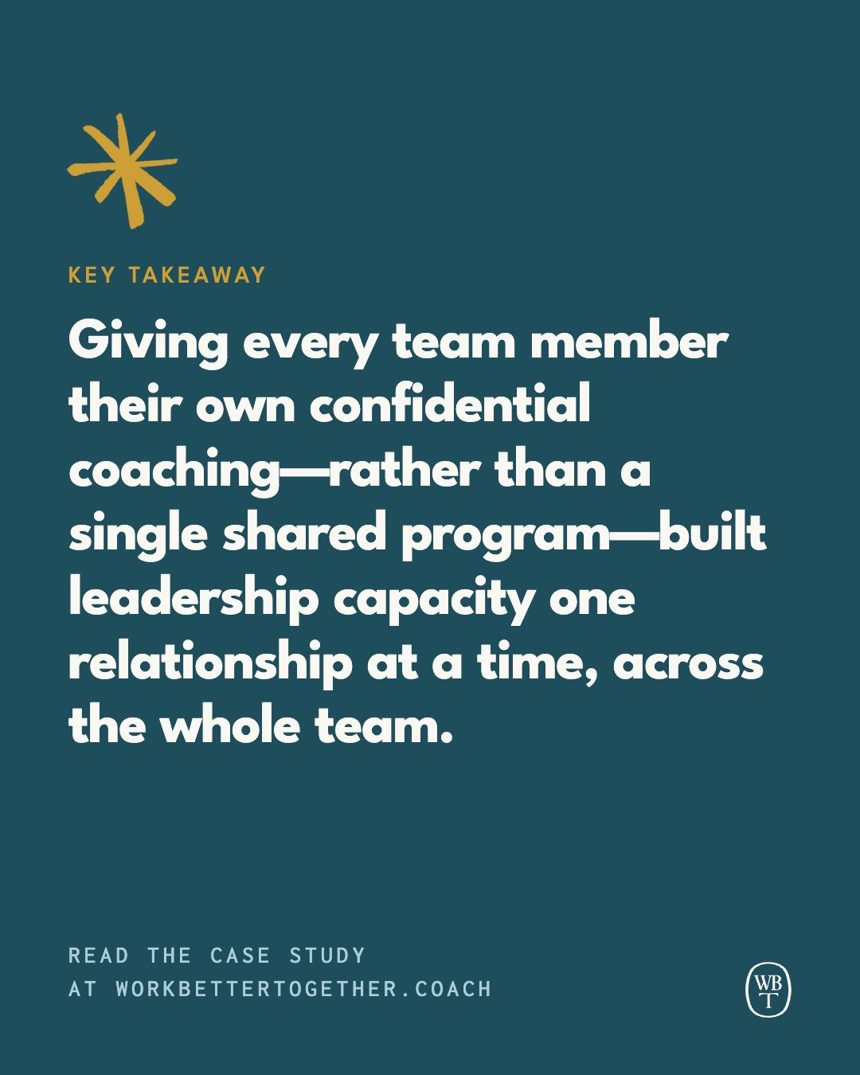
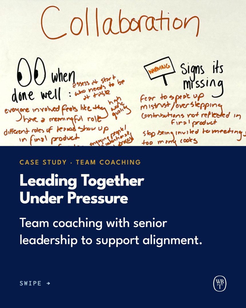
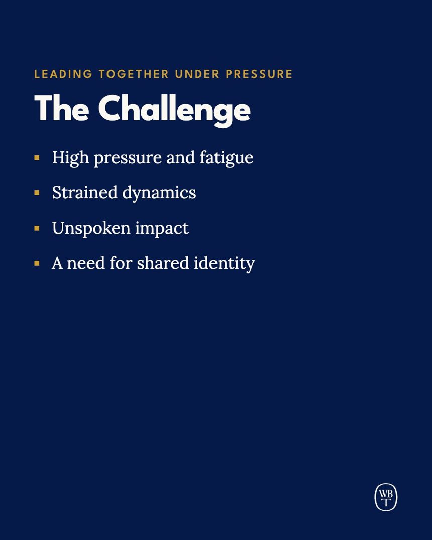
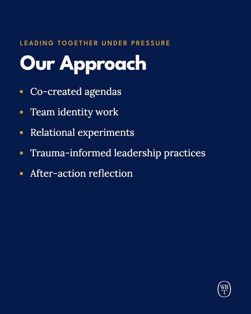
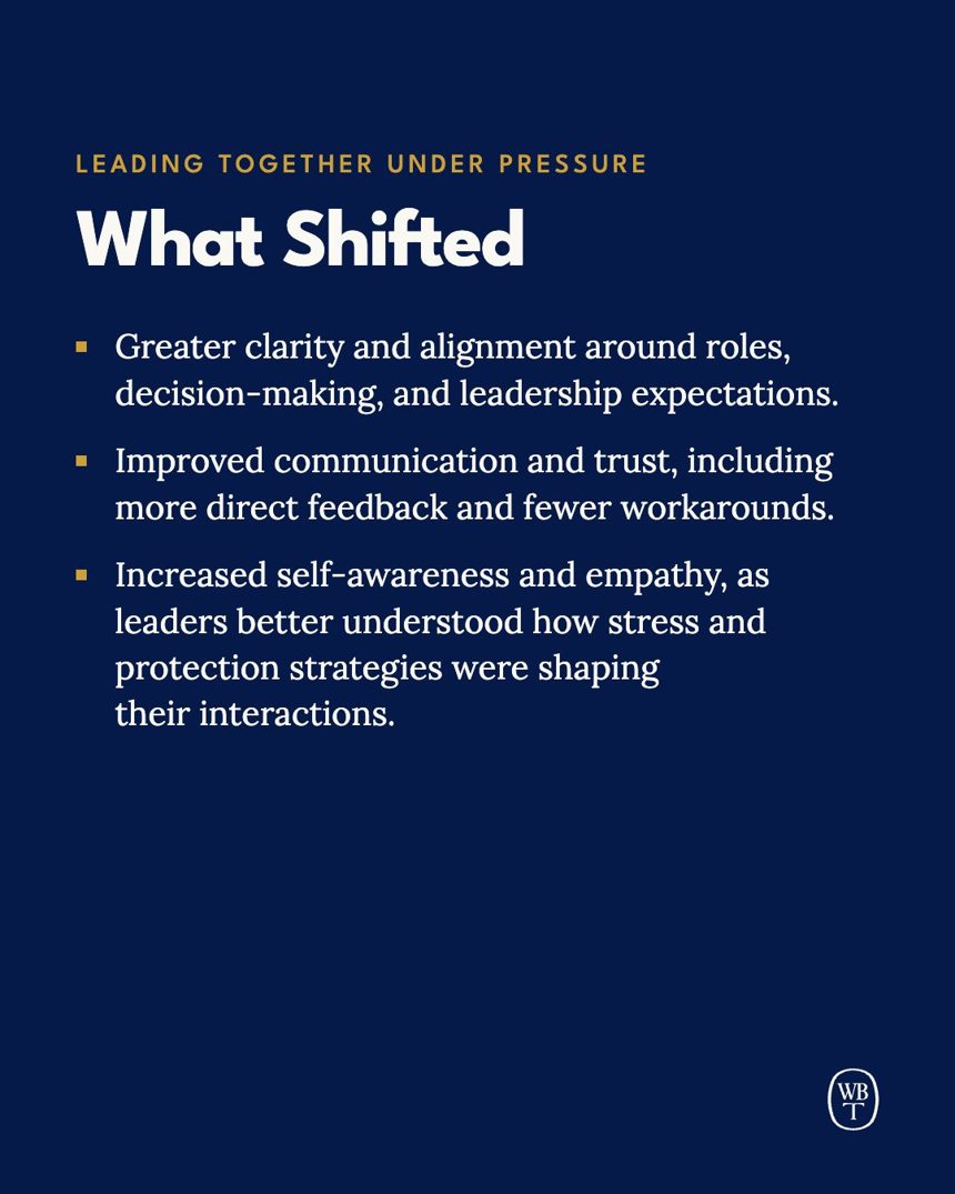
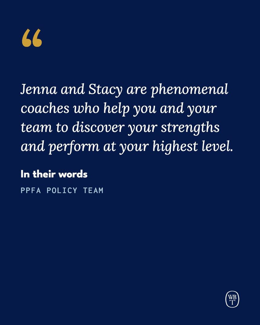
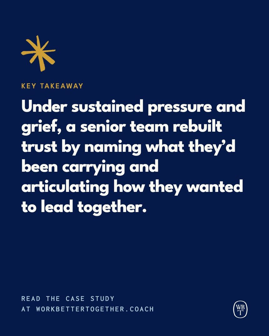
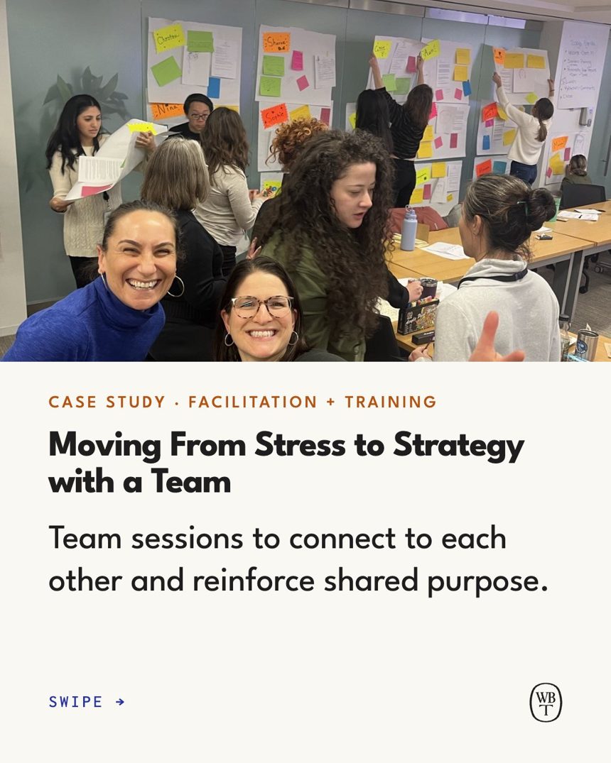
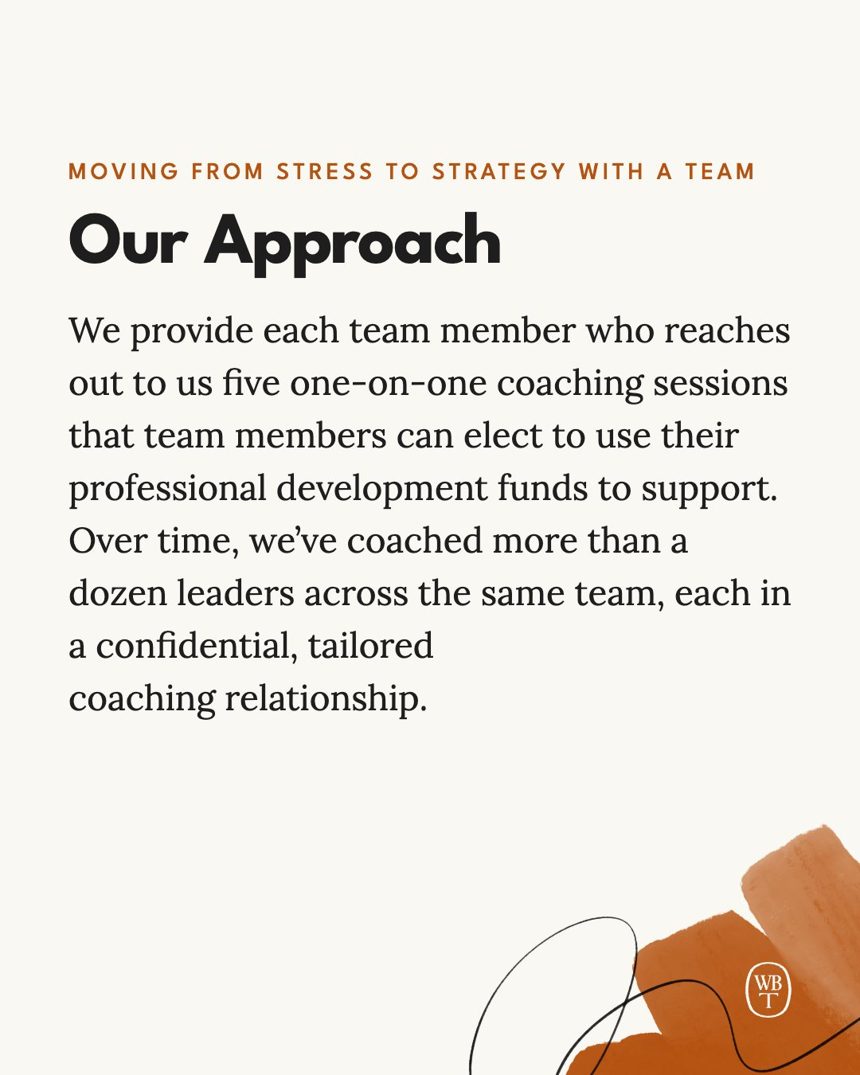
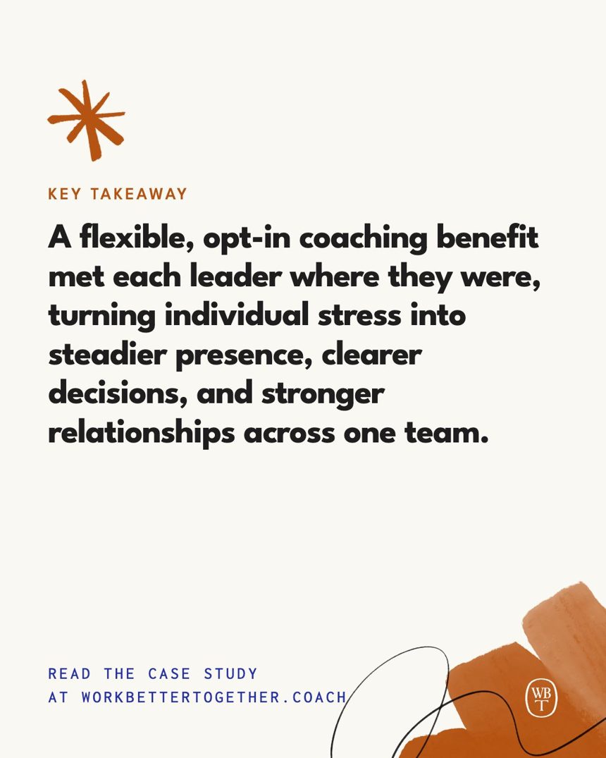
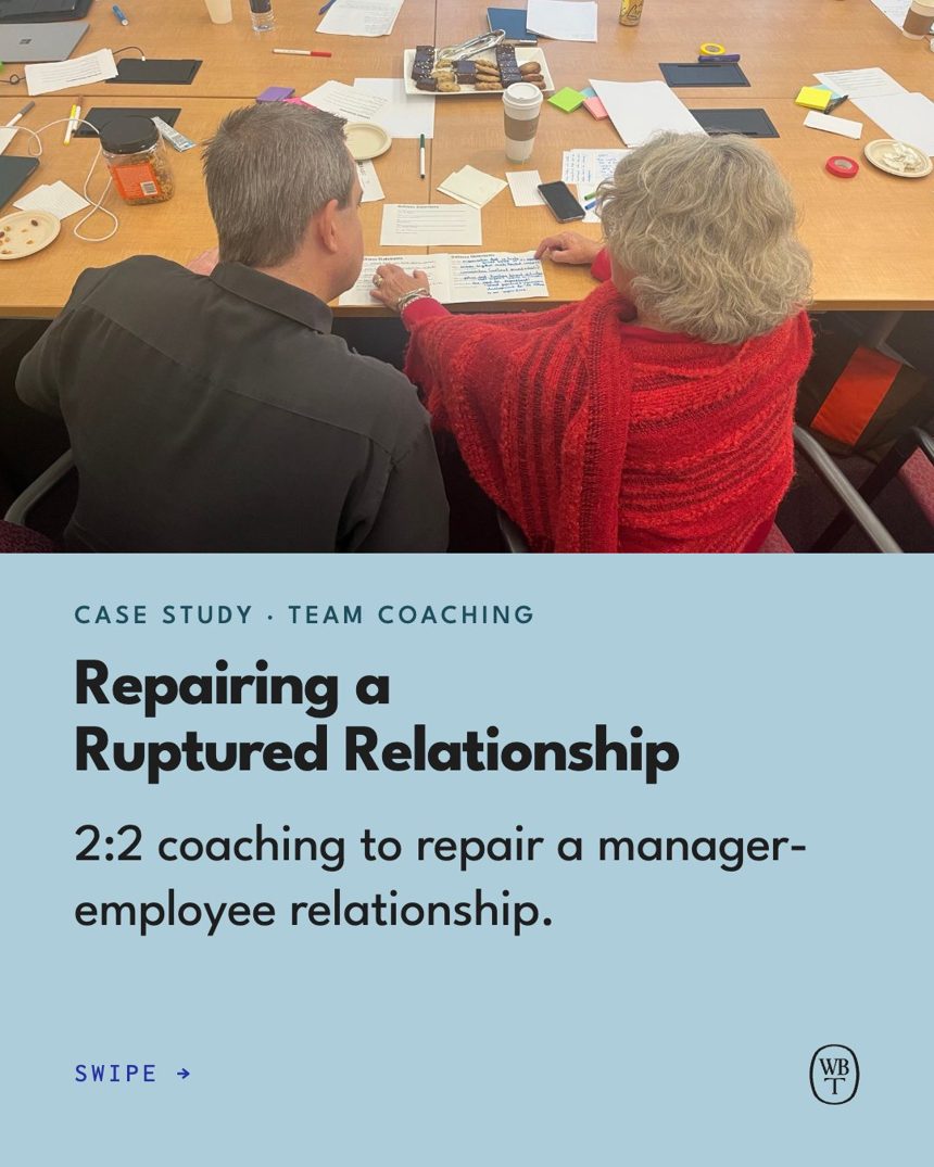
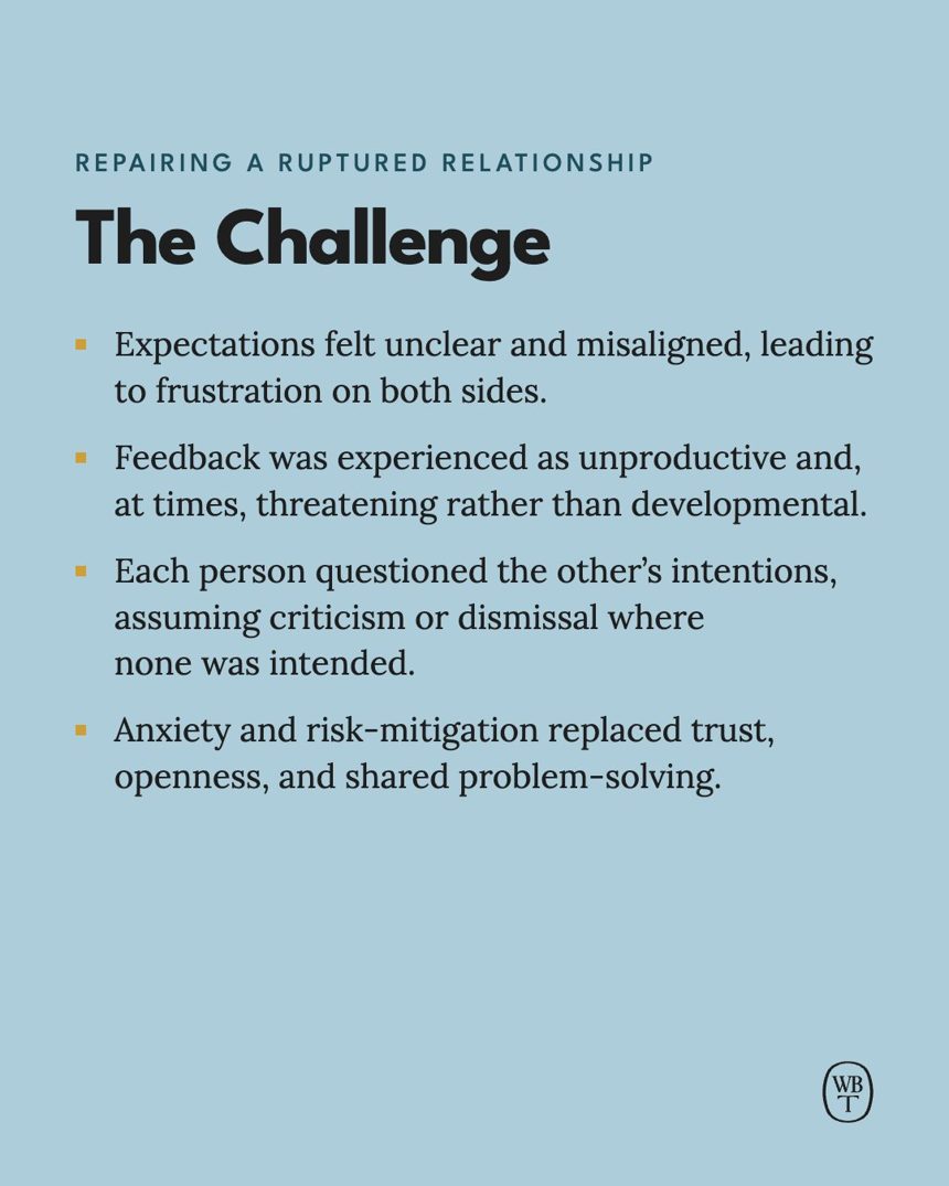
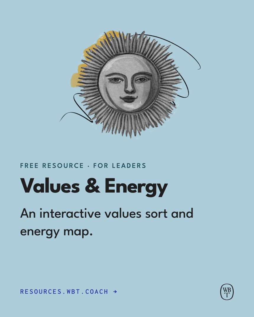
Stories at 1080×1920, with text kept out of the top 250px and bottom 340px where the app's buttons sit. Case studies tell the same beats as their carousels; each free resource gets a short series ending on the link. Stories carry less reading than carousels: about 30 words a screen, so a long beat runs over two frames. Three across, animated with Come Together: each frame's words gather line by line, hold long enough to read, then drift apart into the next. Press play.
Case studies
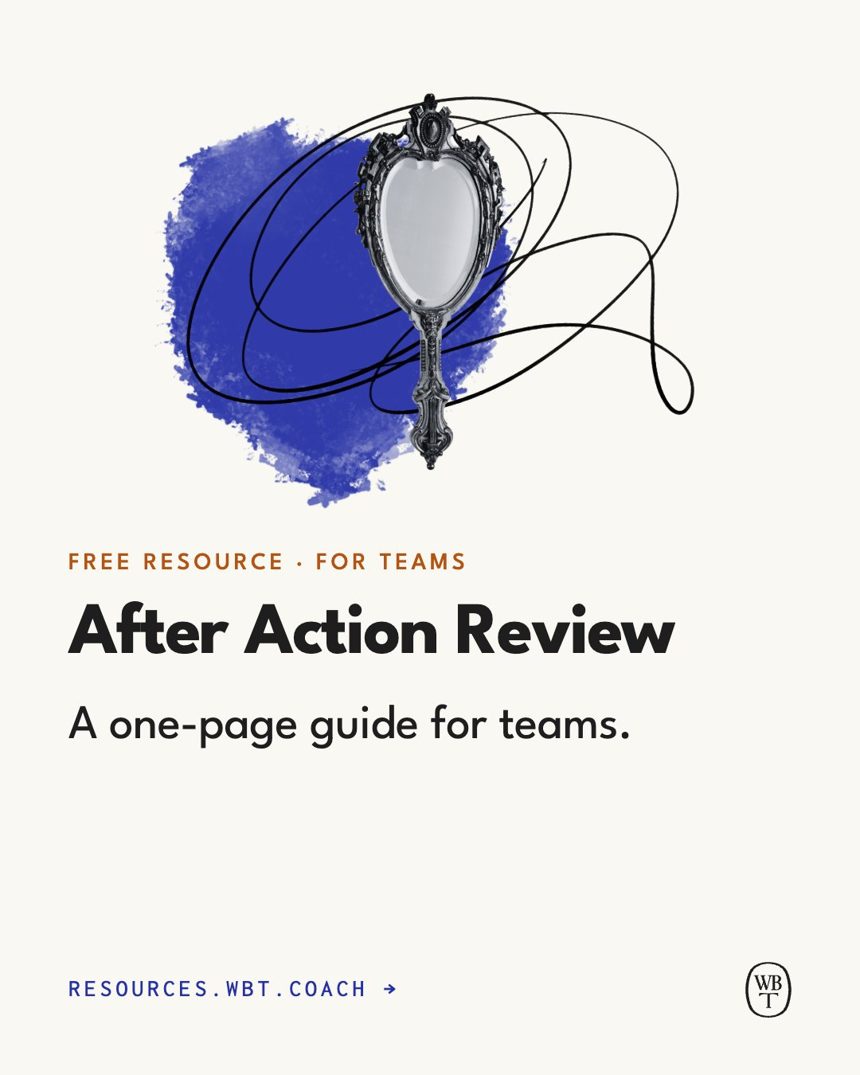
Free resources
- Sizes. Headlines 64–92px, body 36px or more, eyebrows 30px, nothing below 26px on a 1080px card. Phones show cards at a third of their size.
- Margins. 86px (8%) on every side. Text never touches the monogram: keep 24px clear around it.
- Logo. The monogram, bottom right, 70px tall. Black on light grounds, Clear White on dark.
- Collages. Spot, then scribble, then illustration, built from the real files. Scribbles stay black, so collage posts go on light grounds.
- Color. Mostly solid brand colors; a watercolor wash now and then. On dark washes, a tint of the same color keeps text readable.
- Words. Quotes and case study lines are word for word. Links go in the caption; on Stories, the web address and a link sticker.
- Stats. Intentional Blue or Honest Ochre on light grounds, Radiant Gold on dark. Always name the source.
- Motion. Posts can animate with Come Together: see Motion.
Make posts like these with the WBT Brand skill in Claude (download it, with install steps, from Downloads). It knows these layouts, sizes and colors, uses our real collage files, and checks its own work. Try:
- Make an Instagram post with a client quote from our website.
- Turn our latest case study into a six-slide carousel and a Story.
- Make a three-part Story announcing our After Action Review worksheet.
- Make a stat post with the 70% leadership figure, on Clear White.